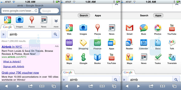
Revamped Google mobile interface on iOS devices came and went, did you catch it?
Anyone else caught wind of this? Apparently some iOS users have recently stumbled upon a revamped version of Google’s mobile site. Primarily the changes are cosmetic but in a big way. It appears Google have gone for a more graphical UI, displaying their primary services via an app screen style, 4×3 layout with tabbed window elements to boot.

The icons aim to help specify your search terms with categories such as images, places and news. More categories are accessible from the ‘more’ tab as well. The other Google Apps include links to YouTube, Buzz, Translate and Maps. As quickly as this ‘update’ appeared it disappeared, with users now unable to access to remodelled service. Whether this was a test run with the intention of trying things out or a precursor to an official update, iOS users everywhere will know soon enough. Have you bumped into this next-gen Google web UI or has it passed you by?
Featured
Categories
- Mobile phones
- Mobile software
- Mobile computers
- Rumors
- Fun stuff
- Various
- Android
- Desktop software
- Featured
- Misc gadgets
- Gaming
- Digital cameras
- Tablets
- iOS
- Desktop computers
- Windows Phone
- GSMArena
com - Online Services
- Mobile Services
- Smart Watches
- Battery tests
- BlackBerry
- Social Networks
- Web Browsers
- Portable Players
- Network Operators
- CDMA
- Windows
- Headphones
- Hands-on
 HTC One M9+ preview
 Your verdict on Android M, iOS 9 and Watch OS 2.0
 Benchmarking Asus ZenFone 2 ZE551ML with Intel Atom Z3580 SoC and 4GB of RAM
 HTC One E9+ performance benchmarks
 Lenovo A7000 Preview
Comments
Rules for posting