Redesigned stock Android icons leak out online
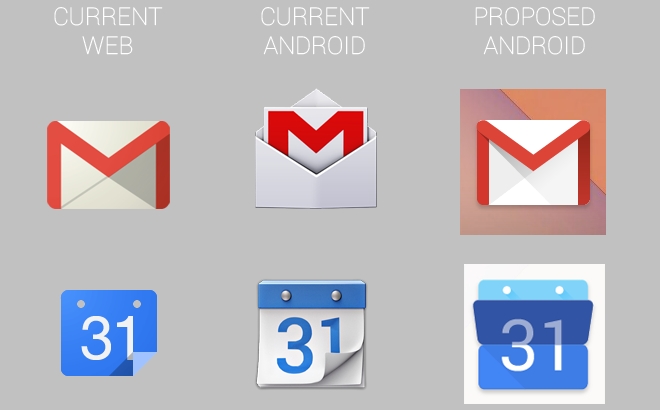
It appears that Google is about to give the stock Android user interface a visual overhaul. Documents and screenshots obtained by Android Police reveal redesigned icons coming our way in the near future.

Reportedly, the new direction in Android iconography is dubbed Moonshine. It is similar to the style used by Google for its online services, and utilizes flatter-looking icons. See it below.


Leaked redesigned Android iconography (click to enlarge)
It must be noted that the leaked icons might not be final in terms of design. Everything could be subject to change before the things go official.
Details on the debut of the new Android icons are yet to be revealed. I personally expect to see them break cover as part of a new Android version during the upcoming Google I/O developer conference in late June.
Featured
Categories
- Mobile phones
- Mobile software
- Mobile computers
- Rumors
- Fun stuff
- Various
- Android
- Desktop software
- Featured
- Misc gadgets
- Gaming
- Digital cameras
- Tablets
- iOS
- Desktop computers
- Windows Phone
- GSMArena
com - Online Services
- Mobile Services
- Smart Watches
- Battery tests
- BlackBerry
- Social Networks
- Web Browsers
- Portable Players
- Network Operators
- CDMA
- Windows
- Headphones
- Hands-on
 Hot or Not: Android M, iOS 9 and Watch OS 2.0
 Xiaomi Mi 4i battery life test
 Oppo R1x battery life test
 HTC One M9+ preview
 Benchmarking Asus ZenFone 2 ZE551ML with Intel Atom Z3580 SoC and 4GB of RAM
Comments
Rules for posting