Our Apple iPad review, Part 1: Hardware overview and our general take on software
Apple have always been trend setters – a lot of their products’ names become synonymous with the class of gadget they are a part of. Many people would say ‘iPod’ when they really mean an MP3 player.
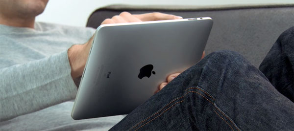
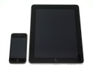
The iPad has all the potential to become equally synonymous to tablets and finally break them out of their niche market status. The iPad is a midway device – between a smartphone and a laptop (between an iPhone and a MacBook if Steve Jobs has his way).
We’ve been playing around with an Apple iPad 16GB for a few days now and we’re ready to share our impressions in this review…
Before we get into details, we’ll begin with the customary overview, listing both pros and cons. While we have the basic version, the added 3G modem and extra internal memory would not change the experience dramatically.
Key features
- Magnificent 9.7” capacitive touchscreen display with a resolution of 1024 x 768 pixels; oleophobic coating
- Wi-Fi 802.11 a/b/g/n connectivity
- Optional 3G connectivity (data only) with A-GPS
- 1 GHz Apple A4 CPU ensures great performance
- iPhone OS 3.2
- 16/32/64 GB of onboard storage
- GPS receiver
- Weight of 680 grams (730 grams for the 3G version)
- Very slim 13.4mm waistline
- Bluetooth 2.1 + EDR
- 10 hours battery life and 1 month of stand-by
- Accelerometer and compass
- Compatible with every iPhone app without any modifications
- The cheapest version costs less than an unlocked iPhone
- iBook application
- The keyboard dock (purchased separately) easily converts the iPad into a nettop
- Handles a variety of formats – Microsoft Office files, Apple iWork files, PDF, RAW image files
- 720p video playback
Main disadvantages
- It’s not a computer but a big iPod Touch
- No multitasking yet (OS 4.0 will add multitasking)
- iPhone apps either leave a lot of unused screen real estate or look pretty bad when uspcaled
- No Flash support for the web browser
- No camera
- No standard USB port (you can get USB connectivity with an accessory but you need to pay extra)
- iTunes required for uploading content
- No kickstand – it cannot stand on a table without a dock or stand
- It’s pretty easy to drop
- No exchangeable battery
- Typing is quite uncomfortable (you can get the keyboard dock for less than some stands and it’s more useful)
- 3G model uses micro-SIM, instead of a regular SIM for the 3G models
- No memory card slot (you can get the camera connection kit, which doubles as an SD card reader)
- Mono loudspeaker
- Maximum TV-out resolution is 1024×768, which makes 720p video decoding pointless
As you can see, several of the iPad disadvantages can be remedied with an add-on, but unsurprisingly for Apple, they come at a price (and not a low one, either). So, when calculating the price of the iPad, make sure to include any add-ons you might need to the total sum.
Speaking of add-ons, the keyboard dock, seems very cool, necessary even, if you’re planning using iWork for more than presentations. But does it defeat the purpose of getting an iPad over a netbook?
We can tell you’ve got plenty of questions, so without further ado, we get to reviewing.
Opening the box
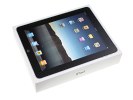
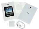
The box that the iPad comes in is barely bigger than the device itself. In it you’ll find your brand new iPad, a short manual, a very compact charger and a USB to Dock connector cable.
The package contents are quite modest, some sort of carrying case to protect the iPad from scratches would have been nice. The iPad case offered on Apple’s site looks great – it holds the device in several different positions, including one that looks comfy for typing. It can be yours for 39 US dollars.
Hardware
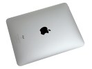
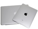
The iPad uses an aluminum unibody design utilized in many Apple products – it really looks more “MacBook” than any of the iPhones. including the original iPhone. Encasing something in metal is just asking for reception problems though – and there’ve been reports of just that around the Internet.
Instead of taking it for granted, we ran a few Wi-Fi tests ourselves – it performed on par with a regular Atom netbook and doubled the performance of an iPhone 3G.
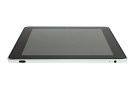
A metal casing is always a premium feature though and with the iPad’s almost impossible thickness of just 13.4 mm it causes a sense of wonder how they’ve constructed such a thing.
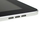
As far as hardware controls go, the iPad doesn’t have many – there’s the Home key on the front, of course, and the lock key on top, plus a volume rocker on the right.
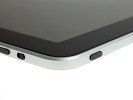
Just above the volume rocker is the rotation lock switch – once you flip it, the iPad screen stays in its current orientation no matter how much you tilt the device. Speaking of screen rotation, the iPad can rotate the interface left, right even turn it head down – even on the homescreen, which is something not available on the iPhones yet..
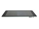
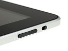
The volume rocker and the rotation lock switch
This rotation lock is useful – the iPad’s accelerometer does well and very rarely jumps the gun on rotating the screen, but there are situations where you want to disable the autorotation and that’s when the switch proves quite useful.
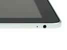
The top part of the iPad houses the 3.5mm AV connector jack (works for audio and composite TV-out) and the microphone. The iPad doesn’t have a camera, so video chats are out of the question, but voice chats are possible.
At the bottom is the well-known Dock connector and the loudspeaker. Now, this is the only speaker – two would have been better, given the iPad’s aspirations to be a video player. For proper audio experience, you’ll need to connect external speakers.
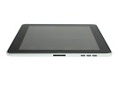
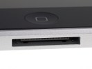
The iPad’s bottom houses the Dock connector and the lone loudspeaker
Above the screen, there’s an ambient light sensor, which can automatically adjust the brightness of the screen.
Holding the iPad
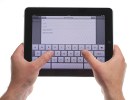
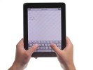
You’ve seen the promo videos for the iPad – they often show someone holding it in one hand and browsing with the other. Well, it’s possible but not easy.
At 680 grams (730g if you’ve got the 3G version) the iPad is heavier than it looks. So, you can grab it by the edge and hold it for a while, but it won’t be long before your hands begins to tire and you start wondering if you’ll drop your shiny new iPad – especially if you hold it in landscape orientation.
The aluminum back is great to the touch, but doesn’t provide much grip – and the iPad is not a cheap gadget, so seeing that big screen cracked would be a real pain in the pocket.
The screen bezel which initially seems a bit on the thick side, is actually about a thumb wide – just enough so that you can hold it without pressing anything on the screen.
You could try holding it with your hand under the iPad, but again you’re hand would get tired in a while and you get even less grip.
So, for long browse-a-thons you’ll want to rest the iPad on your legs (in bed on a lazy Saturday morning, no doubt) or buy a desk stand. There’s no way around it. That’s also the main reason Apple didn’t include one in the retail package.
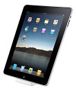
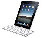
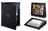
Some of the official iPad docks and the useful-looking case
Now, iPad stands range from a repurposed $5 business card holder to a $100+ piece of overpriced art. Or you could buy the keyboard dock (which will run you 69 US dollars).
But the point is that the iPad is not very comfortable to use if you just let it lie on a table – it wobbles as you type and you practically have to be standing up to or crane over it to view the screen head-on.
Screen
The iPad’s screen doesn’t have a terribly impressive resolution considering some phones have WVGA screens with a diagonal of less than half the length, but that’s what the numbers say.
When viewed in real life, the screen is excellent. The image is crisp with vibrant colors (it’s better than the iPhone’s screen in this respect) and has excellent viewing angles (again, better than the iPhone).
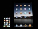
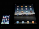
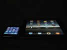
The iPad’s screen has excellent viewing angles
Sunlight legibility is very good but not trouble-free. The screen is very reflective and depending on the angle, it can even reflect the sun directly in your eyes. But you can find an angle when that doesn’t happen, though you still have fingerprints to worry about (as any touch-operated device, the iPad accumulates a lot of them, despite the special coating).
Still, when you wipe the screen and find a good angle that doesn’t shine the sun in your eyes, the text is very readable. The screen is not as bright as the iPhone’s screen though, even at the brightest setting. So, yes, it is possible to read eBooks on the iPad, but we’re not sold on the idea that it can replace dedicated eInk based readers.
Mind you, the side viewing angles are so good that you’d barely have any privacy when reading your emails on the train or generally when in public.
The softer side of things
The iPad is a big iPod Touch. End of discussion. If you have used one, you will know how to find your way around the other. Our prayers for a proper OS for the tablet went unanswered and the result is the iPad as we see it today.
It’s not necessary all bad that the slate runs on an upsized version of a platform that was initially designed for use on mobile phones. The performance for one is stunning and probably better than most WinMo 7 devices in this price and size category can offer you.
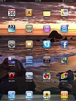
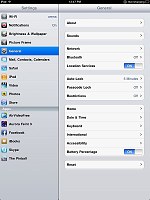
iPhone users will feel at home with the iPad
Waiting and lagging is nowhere to be seen around the interface, no matter what we threw at the iPad. But in a single-tasking OS that doesn’t sound that much of a feat.
Check out our demo video of the iPad’s user interface:
The good news is that Apple did come up with a few tweaks to maker better use of the iPad larger screen estate and higher resolution. There are now split screens in most apps (calendar, email, settings etc.) that allows you to see more of the content simultaneously.


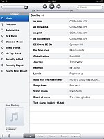
Split screens save you some clicks
The drop down selectors and pop-ups no longer occupy the whole screen but only a part of it as is more natural. Tap-and-hold now works in more places and other similar stuff that is nice but not quite vital.
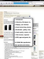

Pop-ups no longer take the whole screen
Springboard wallpapers are also now available and they look pretty nice – we guess even better than they would ever look on the crammed iPhone screen.
With the increased processing power it would have made sense if multi-tasking was implemented on the iPad from its launch. Instead you are forced to do things the good old one-at-a-time way that is oh-so-outdated.
One would expect that you don’t have to close a game you are playing to open a web page and check out some live scores, only to wait for it to load again from the start. Your progress is usually stored and applications resume from where they started but all this waiting kills the nice impressions from the smooth performance.
We guess they’ll add multi-tasking to the iPad with iPhone OS 4.0, but that won’t happen before September.
One of the iPhone platform greatest advantages – the numerous apps, are a bit of a mixed thing for the iPad. The original iPhone apps, for instance, are fully compatible with the iPad, but only occupy a tiny center bit on the screen in default mode and look disastrously pixilated when stretched to full screen.

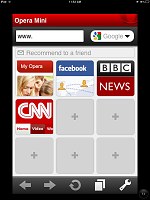
iPhone apps zoomed in to fill the screen aren’t nice to look at
Still, as more applications get their HD versions this problem will be solved, but we guess it will take a while. But the HD apps in the Apple AppStore tend to cost more than their regular versions.
So the general experience from the Apple iPad software package is this: it’s hardly fit for serious work but its snappy and packs quite a lot of eye-candy. This is strangely in line with the hardware impressions and confirms the feeling that the device that Apple see filling the (ever-contracting) gap between the mobile phone and the computer is a sized up mobile phone, and not a miniaturized computer. And as it turns, we’ve always imagined it the other way around.
And here goes the second part of our iPad review:
Our Apple iPad review, Part 2: Multimedia, iBooks, gaming, wrap-up
Featured
Categories
- Mobile phones
- Mobile software
- Mobile computers
- Rumors
- Fun stuff
- Various
- Android
- Desktop software
- Featured
- Misc gadgets
- Gaming
- Digital cameras
- Tablets
- iOS
- Desktop computers
- Windows Phone
- GSMArena
com - Online Services
- Mobile Services
- Smart Watches
- Battery tests
- BlackBerry
- Social Networks
- Web Browsers
- Portable Players
- Network Operators
- CDMA
- Windows
- Headphones
- Hands-on

 Oppo R7 battery life test
 Oppo R1x battery life test
 Samsung Galaxy S6 updated to Android 5.1.1: exploring the differences on video
 Hot or Not: Android M, iOS 9 and Watch OS 2.0
 Benchmarking Asus ZenFone 2 ZE551ML with Intel Atom Z3580 SoC and 4GB of RAM
Comments
Rules for posting