Notifications and quick toggles gets separated in Android 4.2 with dual pull-down blinds
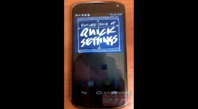
Reportedly, the notification area is about to get a complete overhaul in the upcoming Android 4.2 update. A recent video shows a two separate pull-down bars – the first one to hold all of your notifications and the second – the entire quick settings/toggles gang.

The Jelly Bean update didn’t bring quick toggles in the notification area as expected, but most of the manufacturers offer them within their custom UI launchers (TouchWiz, Sense, etc.).
It seems Google has finally come up with a solution that won’t sacrifice the notification space and you won’t need to scroll throughout one row holding many toggles. In addition to the standard notification area, we’ll get a second pull-down blind holding every possible setting we’ll need. But we don’t know how this will actually look, since it’s still in development.
Unfortunately, we wouldn’t be able to get to the settings before we’ve already brought down the notification window, so it will take two swipes down to reveak. Of course, it is highly possible that Google implements a new gesture or allow us to choose which bar to come up first.
I guess we’ll have to wait for Google’s official Android 4.2 presentation when time comes for that.
Featured
Categories
- Mobile phones
- Mobile software
- Mobile computers
- Rumors
- Fun stuff
- Various
- Android
- Desktop software
- Featured
- Misc gadgets
- Gaming
- Digital cameras
- Tablets
- iOS
- Desktop computers
- Windows Phone
- GSMArena
com - Online Services
- Mobile Services
- Smart Watches
- Battery tests
- BlackBerry
- Social Networks
- Web Browsers
- Portable Players
- Network Operators
- CDMA
- Windows
- Headphones
- Hands-on
 Samsung Galaxy S6 updated to Android 5.1.1: exploring the differences on video
 Hot or Not: Android M, iOS 9 and Watch OS 2.0
 Lenovo A7000 Preview
 HTC One M9+ preview
 Oppo R1x battery life test
Comments
Rules for posting