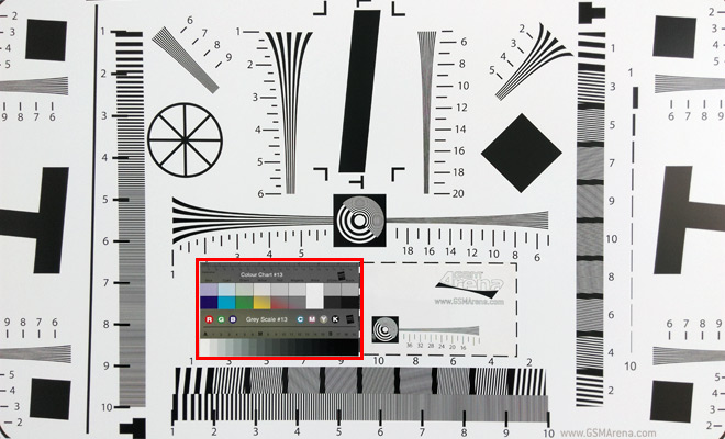
Notice about our Photo Compare Tool
We announced our Photo Compare Tool almost four years ago and since we’ve amassed a huge collection of camera samples from all the phones and tablets we’ve tested. Since photos are taken in controlled conditions, it allows direct comparison between devices.

However, we recently discovered that time – and the sun – have taken their toll on one of our charts.
We shoot three distinct charts – a standard ISO resolution chart, a gray chart to test contrast and noise reduction and a final colorful chart. The first two charts sit in a room with natural light, while the third one is shot under artificial lighting.
We had tweaked the ISO chart with a panel of color swatches and another panel to test extra high resolutions, which came in handy when the Nokia 808 PureView was announced and is becoming increasingly more useful.
Anyway, as we said we recently spotted that some older phones rendered the color patches better than current ones. Upon closer inspection we realized that the colors have faded over time – it happened so slowly that no one noticed and there’s virtually no difference when comparing competing devices.
Be warned though, if nostalgia takes you and compare a phone from a couple of years ago with a modern one you should use the third chart when judging color rendering.
We’ve replaced the color swatches and are reshooting that chart with all phones we have in our office. Soon all current flagships will have updated samples for that chart.
The other two charts are unaffected.
Featured
Categories
- Mobile phones
- Mobile software
- Mobile computers
- Rumors
- Fun stuff
- Various
- Android
- Desktop software
- Featured
- Misc gadgets
- Gaming
- Digital cameras
- Tablets
- iOS
- Desktop computers
- Windows Phone
- GSMArena
com - Online Services
- Mobile Services
- Smart Watches
- Battery tests
- BlackBerry
- Social Networks
- Web Browsers
- Portable Players
- Network Operators
- CDMA
- Windows
- Headphones
- Hands-on
 HTC One M9+ preview
 Your verdict on Android M, iOS 9 and Watch OS 2.0
 Lenovo A7000 Preview
 Benchmarking Asus ZenFone 2 ZE551ML with Intel Atom Z3580 SoC and 4GB of RAM
 Xiaomi Mi 4i battery life test
Comments
Rules for posting