Nokia Lumia 1320 and Lumia 525 hands-on
A couple of days ago, Nokia announced the Lumia 1320 and the Lumia 525 in the Indian market, which is one of the first few markets to receive either of these devices. The Lumia 1320 is mid-range phablet whereas the Lumia 525 is a relatively low-end smartphone.

We got to spend some time with both the devices to bring you this brief hands-on.
Lumia 1320
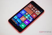
The Lumia 1320 carries much of the imposing size of its more premium sibling, the Lumia 1520. It has a massive 6.0-inch, 1280×720 ClearBlack IPS LCD up front, same size as that on the 1520 but without that glorious 1080p resolution. On paper, then, it doesn’t seem like much and indeed if you look closer, those used to more pixel-dense displays will see the rough edge on the fonts but we were pleasantly surprised by the overall image quality of the display. This is a really good screen to look at and other than pixel density enthusiasts everyone else should be quite satisfied with it.
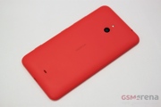
The design deviates slightly from that on the 1520, with curved edges all round and a removable back cover that lets you switch to other color options. Despite the removable cover, however, the build quality remains commendable. The phone does seem slightly heavy, though, but not a lot more than you’d expect from a device this size.
As with the 1520, the 1320 has some specific alterations to the UI for the big screen. The homescreen, for example, now shows three columns of medium sized Live tiles and the Settings app shows a lot more items on the screen at once. But a handful of these optimizations aside, the OS just wastes the extra screen space by just blowing every element up in size instead of showing more content. The on-screen keyboard, for example, is almost the same size as the entire display on the Lumia 525. This is good for those with weak vision but for the rest of us it feels like a wasted opportunity. Hopefully, future versions of Windows Phone 8 are better optimized for bigger screens.
The Lumia 1320 is priced at INR 23,999 ($387) at launch, which is quite good considering what you get. We’ll be taking a better look at the Lumia 1320 in our full review.
Lumia 525
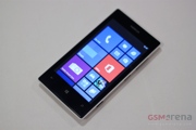
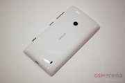
The Lumia 525 is the updated version of the highly successful Lumia 520. One of the important changes is a new design for the back, which mimics the appearance of the Lumia 720. The back covers are removable and come in a variety of glossy colors. Build quality is very good and the phone feels great to hold thanks to the compact size.
The display on the 525 is identical to the 4.0-inch, 800×480 IPS LCD panel on the 520. For the price, the screen is adequate in terms of size and resolution but the colors are a bit washed out.
Nokia has updated the RAM on the 525 to 1GB from 512MB on the 520. This should definitely help improve performance during multitasking and web browsing but will also make the phone compatible with all the apps on the store that require at least 1GB of RAM.
The Lumia 525 is priced at INR 10,399 ($168) at launch, which is again very good pricing. Once again, we’ll be taking a closer look once we have the device with us in our office.
Featured
Categories
- Mobile phones
- Mobile software
- Mobile computers
- Rumors
- Fun stuff
- Various
- Android
- Desktop software
- Featured
- Misc gadgets
- Gaming
- Digital cameras
- Tablets
- iOS
- Desktop computers
- Windows Phone
- GSMArena
com - Online Services
- Mobile Services
- Smart Watches
- Battery tests
- BlackBerry
- Social Networks
- Web Browsers
- Portable Players
- Network Operators
- CDMA
- Windows
- Headphones
- Hands-on


 Benchmarking Asus ZenFone 2 ZE551ML with Intel Atom Z3580 SoC and 4GB of RAM
 Samsung Galaxy S6 updated to Android 5.1.1: exploring the differences on video
 Oppo R7 battery life test
 HTC One E9+ performance benchmarks
 Hot or Not: Android M, iOS 9 and Watch OS 2.0
Comments
Rules for posting