Nokia Conversation’s Design By Community project lets you design a smartphone, they won’t build it though
Nokia Conversations has launched an interesting project – Design by Community. The idea is that over the course of several weeks users can have a go at designing their dream phone.
The first week’s challenge is to pick the display and user interface basics…

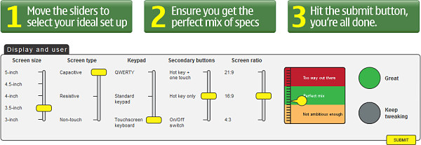
It’s not as complicated as it sounds – there’s a widget, which lets you pick screen size and aspect ratio as well as touch technology (resistive, capacitive, or no touchscreen), also the keyboard (virtual, phone keypad or QWERTY) and miscellaneous buttons.
Your goal is to achieve a perfect mix – an indicator gauges your progress and generally shows one of three areas: “Not ambitious enough”, “Perfect mix” (the one you’re aiming for) and “Too way out there”.
The evaluation process seems to be very simple – the further up you move the sliders (e.g. from 3” to 5” for the screen size) the further up the gauge moves. That is if you want a 5” capacitive touchscreen and QWERTY keyboard, you’ll have to dial down on the aspect ratio (21:9 is probably not a good idea for such a device anyway).

So, when you get a perfect mix, submit your design and wait for next week when the challenge will be Size and shape. Next week’s challenge will depend on what you’ve picked this week.
Head to the Design by Community website and try it out for yourself.
Throughout May 2010 users can vote for their favorite design sketches created by the Nokia Design team. The winning design will be rendered in 3D so the community can marvel at the fruit of their collaborative efforts.
Unfortunately, these designs won’t be turned into real phones. Still, it gives some insight into the design process, so it’s interesting to try out.
Featured
Categories
- Mobile phones
- Mobile software
- Mobile computers
- Rumors
- Fun stuff
- Various
- Android
- Desktop software
- Featured
- Misc gadgets
- Gaming
- Digital cameras
- Tablets
- iOS
- Desktop computers
- Windows Phone
- GSMArena
com - Online Services
- Mobile Services
- Smart Watches
- Battery tests
- BlackBerry
- Social Networks
- Web Browsers
- Portable Players
- Network Operators
- CDMA
- Windows
- Headphones
- Hands-on
 Xiaomi Mi 4i battery life test
 Hot or Not: Android M, iOS 9 and Watch OS 2.0
 HTC One E9+ performance benchmarks
 Oppo R7 battery life test
 HTC One M9+ preview
Comments
Rules for posting