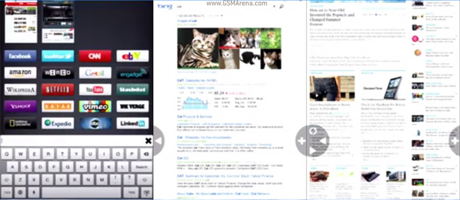
Mozilla Junior prototype re-imagines the browser interface on the iPad
Mozilla are always toying with new designs for a web browser – their latest effort is called ‘Junior’ and is a browser prototype for the iPad with a design that’s a clean break from the standard Safari browser.

Mozilla created Junior because even though, according to them, the iPad offers the best browsing experience on a tablet, it’s still “miserable”.
Junior doesn’t do traditional URL bars, tab switchers, menus and so on. Instead, it presents the web site in full screen with two overlaid buttons that are cleverly positioned just under your left and right thumb. The two buttons are Back (on the left) and Plus (on the right).
Forward and refresh buttons are hidden next to the back button, while next to the Plus button there are hidden Share and Print buttons.
The plus button allows you to go to new places. On top you have something that combines tabs with history – thumbnails that let you switch between the sites you’ve visited recently, but they are not exactly tabs.
Below are your favorite sites with each sites logo and below that is the usual URL bar, which you can use to open a new site.
On the technical side, Junior uses WebKit behind the scenes because Apple doesn’t allow third-party HTML engines to run on the iPad. That doesn’t matter really – Junior is all about the user interface.
You can watch a lengthy presentation of Junior along with many other things that Mozilla is working on below (note: HTML5 video). Junior is at the 30 minute mark.
What do you think of Junior’s interface? I think it’s pretty awesome and hope to see it make the jump to Android and graduate to a proper product and not end up a dead prototype.
Featured
Categories
- Mobile phones
- Mobile software
- Mobile computers
- Rumors
- Fun stuff
- Various
- Android
- Desktop software
- Featured
- Misc gadgets
- Gaming
- Digital cameras
- Tablets
- iOS
- Desktop computers
- Windows Phone
- GSMArena
com - Online Services
- Mobile Services
- Smart Watches
- Battery tests
- BlackBerry
- Social Networks
- Web Browsers
- Portable Players
- Network Operators
- CDMA
- Windows
- Headphones
- Hands-on
 Xiaomi Mi 4i battery life test
 Benchmarking Asus ZenFone 2 ZE551ML with Intel Atom Z3580 SoC and 4GB of RAM
 Lenovo A7000 Preview
 Oppo R1x battery life test
 Your verdict on Android M, iOS 9 and Watch OS 2.0
Comments
Rules for posting