Meizu MX takes us on a heavily modified Android journey, we can’t shake off the iPhone feeling [VIDEO]
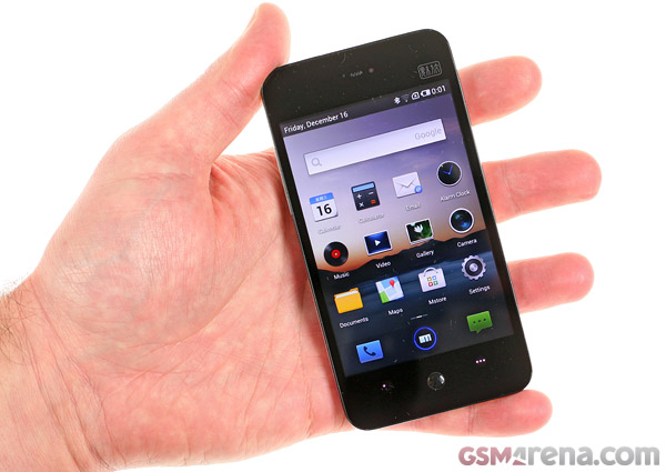
One of the most unusual smartphones that you have seen just landed in our office – the Meizu MX. At its core, it’s an Android phone, but it takes a lot of design cues from the iPhone. What’s unique about it is that it’s from a Chinese company – a lot of companies have their gadgets assembled in China, but this one was also designed there.

China has all the potential to become a tech powerhouse – and the Meizu MX is probably just the first of many high-end gadgets that have an actual chance of dethroning the current top phones.
Inside the Meizu MX is an Exynos 4210 chipset, with a dual-core 1.4GHz Cortex-A9 processor and 1GB of RAM – basically, the same chipset you get with the Samsung Galaxy Note. The MX also packs an 8MP camera with FullHD video recording.
The screen is 4″ big and has 640×960 pixels resolution, which add up to a very high 288ppi pixel density. It’s not much taller and wider than an iPhone 4S despite having a tangibly bigger screen. Unfortunately, it’s not as thin as the Apple smartphone, but at 10.3mm it’s not thick by any means either.
All in all, the Meizu MX seems to have what it takes to challenge the Samsung Galaxy S II and the iPhone 4S.
A really cool bit is the capacitive soft keys – they are situation aware, meaning they change their look based on what function they serve at any given moment. They can be a back key, a menu key, a lock key – you’ll see what we are talking about in the video that’s coming up. They also rotate with the phone’s orientation (kind of like the HTC Incredible S). And those aren’t even all the cool bits about these keys, but we’ll leave the rest for the cool review.
We should note that the box you see in the video is an engineering sample and the retail box will look differently (more importantly, the charger will be inside it).


Meizu MX engineering sample box
Before we show you the video though, we’d like to say a few words about the software. It’s Android 2.3.5 underneath and will run Android apps (and quite easily at that, knowing how powerful the chipset is). But the interface is almost completely redesigned.
First off, there’s no application drawer – your shortcuts, folders and widgets sit on the homescreens. It’s kind of cramped, but the Meizu MX barely has any widgets preinstalled. Then there’s the notification area – it doesn’t open all the way, only as much as it needs to show its contents.
The task switcher is new too – it’s launched by a press and hold on the right key (not the home key) and features music controls and Wi-Fi/GPS/Sync/etc. toggles. The lockscreen is new too. Actually, a lot about the Meizu MX is new if you’re coming from Android or even iOS.
If you’ve used the Flyme OS (that’s what Meizu calls their modification of Android) on a Meizu M9, it’s probably a lot more familiar, but for most people the MX will be an almost completely new experience.
Here, watch the video and see for yourself. Some of it is Android, some of it is iOS and some of it is Meizu.
Featured
Categories
- Mobile phones
- Mobile software
- Mobile computers
- Rumors
- Fun stuff
- Various
- Android
- Desktop software
- Featured
- Misc gadgets
- Gaming
- Digital cameras
- Tablets
- iOS
- Desktop computers
- Windows Phone
- GSMArena
com - Online Services
- Mobile Services
- Smart Watches
- Battery tests
- BlackBerry
- Social Networks
- Web Browsers
- Portable Players
- Network Operators
- CDMA
- Windows
- Headphones
- Hands-on


 Samsung Galaxy S6 updated to Android 5.1.1: exploring the differences on video
 Lenovo A7000 Preview
 HTC One E9+ performance benchmarks
 Your verdict on Android M, iOS 9 and Watch OS 2.0
 Xiaomi Mi 4i battery life test
Comments
Rules for posting