Leaving Anna for Belle – see what’s next [REVIEW]
We had our first encounter with Symbian Belle when we previewed Nokia 701, but this one was major enough to deserve its own review. So, we decided to take some time and look at Belle all by itself – after all, it would power all of Nokia’s smartphones sooner or later (including the previous-gen N8, E7, C7, C6-01).
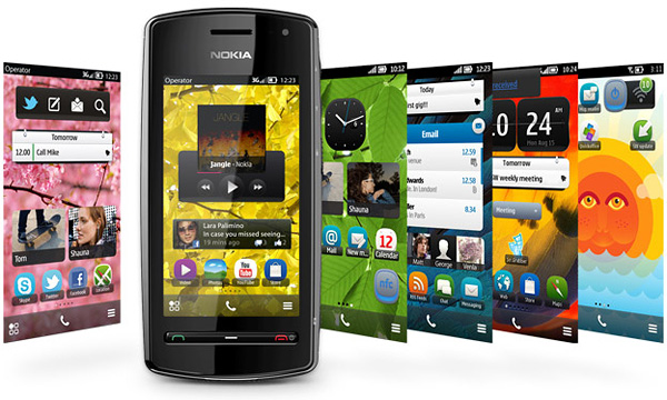
We’ll try to cover the changes in the general user interface and the changes to Symbian’s native apps, but also take a spare a moment to talk about what is still lacking in Belle.
We’ll be using the Nokia 701 as the platform for our Symbian Belle exploration, so we’re borrowing our impressions of the software from its preview. Considering that the 600 and 700 models have very similar hardware, everything here should be true about them too.
Just what the doctor ordered
It’s been a regular one on our list of Cons that Symbian is lagging behind Android and iOS in user experience, but that’s about to change. The key elements in Belle are the new homescreen and menu, the updated native apps and overall polish of the interface.

Symbian Belle has a shiny new look
Here’s an extensive video demo of the interface (starring the Nokia 701), so you can get a good feel of Belle before we start.
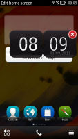
The widget system introduced by Symbian^3 was incomplete to say the least. Now however, you get up to six homescreens (up from three) and you can delete unneeded ones. Each homescreen has its own individual wallpaper, rather than one for all to share.
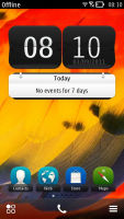
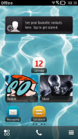
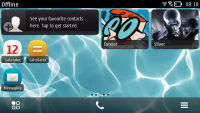
Symbian Belle homescreen in portrait and landscape modes
Widgets themselves have dropped the one-size-fits-all philosophy and now come in up to five sizes. In addition to widgets, you can also put shortcuts on the homescreen – the end of the silly shortcut widgets.
A tap and hold on a widget or shortcut activates edit mode, but only for that widget/shortcut. You can’t touch the others – there’s no mode where you can edit everything at once (which is a bit inconvenient to us). You can move, delete or (where available) access the settings of the selected one.
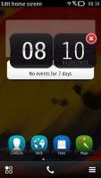
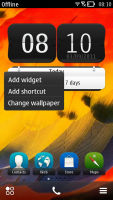
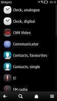
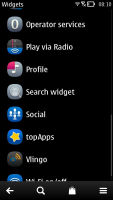
Moving widgets around • Adding a widget to the homescreen.
Besides widgets and app shortcuts you can also add a contact shortcut to the homescreen – you have to go into the Options menu of the contact’s details to do that, but all that is worth it as it’s a very convenient way to access the contacts you call most often.
The bottom of the homescreen has three virtual buttons – menu, dialer and homescreen settings. With these buttons, Nokia can go button-free at the front if they want to, just like they did with MeeGo.
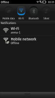
The other big addition to the homescreen is the pull-down status bar at the top of the screen – think Android’s notification area or the similar menu available in iOS 5. This area is where notifications and status info await in line for your attention, but you also get toggles for mobile data, Wi-Fi, Bluetooth and Silent mode.
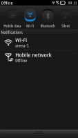
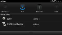
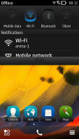
Pull-down menu is always accessible, helpful
This pull-down status bar is available on any screen so you can also quickly change a setting and look up new events.
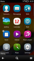
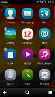
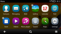
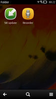
Moving on, the main menu has changed as well – it’s now completely flat, no level upon level of subfolders nonsense any more. Or at least not by default – you could still manually create folders, if you like. You can’t put folders in folders though (not that you’d want to do that anyway).
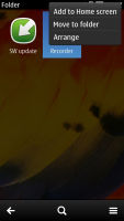
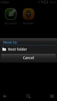
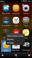
You sort icons alphabetically or manually, by choosing the Arrange option and moving menu items around. You can’t drop a shortcut in a folder while arranging them though. To do that, you have to press and hold on a shortcut, choose Move to folder and then select the desired folder. There are also Add to homescreen and delete options here.
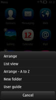
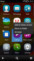
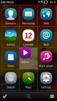
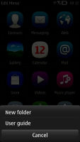
Arranging the menu • Creating a new folder
This arrangement isn’t as convenient as in other OSes and it contrasts with how the homescreen works. On the homescreen you press and hold to move an item, while a tap and hold on a menu item pulls out a menu. To move items around you have to hit the Options key and choose Arrange.
It’s a bit odd how folders on the homescreen work – you can only add a folder to the homescreen by first creating it in the menu. After you add it, it remains visible in the menu.
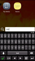
To help you deal with the much busier initial screen of the main menu, the magnifying glass shortcut at the bottom of the screen lets you easily search through the installed apps.
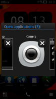
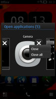
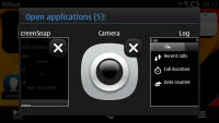
The task manager in Symbian Belle is virtually unchanged – press and hold the Menu key and it pops up. It fits a bunch of side-scrollable thumbnails, one for each of the currently open apps. It’s worth noting that hitting the End key will terminate an app, while pressing the Menu key just goes to the homescreen with the app active in the background.
Some changes to the native apps
Besides the changes to the base user interface, Symbian’s native apps were improved too – we’ll take a quick look at them now.
The user interface of the camera has changed since Anna, but the changes are mostly cosmetic.
At the bottom of the screen, you get a row of shortcuts: Back, Flash mode, Scenes, Extended options and Menu. On the right, there’s a the virtual shutter key and a toggle for the still/video modes. On the left, there’s a digital zoom lever that auto-hides.
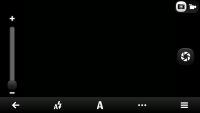
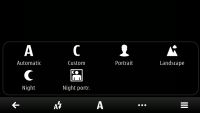
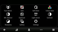
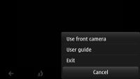
Camera interface in Symbian Belle
In the extended options you get more goodies like face detection, self timer, image settings (ISO, white balance, sharpness, etc.) and a shortcut to one last group of settings where you have geo-tagging and capture tone options.
We were sorely disappointed when we tried to change the ISO setting – it’s a list (Auto, Low, Med, High) and you tap once to select and once again to activate. The Sharpness setting works the same way.
The browser interface has been shuffled a bit, resulting in improved usability, but you shouldn’t expect miracles. On top you have the URL bar, which auto-hides ones you start navigating the page. At the bottom you have a fixed row with five shortcuts – Back, Forward, Bookmarks, Tabs and Menu.
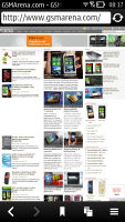
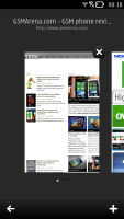
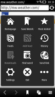
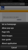
Symbian Belle brings refined browser UI
The addition of the Tabs shortcut makes managing multiple pages easier – in earlier versions you had to go through the popup menu, adding a few extra clicks. The popup menu itself is pretty much the same – you get RSS feeds, find on page, Most visited and other options, along with a “More” option, which brings the final set of options.
We missed the full Flash support, however – while Flash Lite 4.0 is adequate most of the time, there are cases when it just doesn’t cut it.
The Music player has seen some changes, too. The functionality is pretty much the same (but that was good to begin with, so it’s not an issue) but the UI has been nicely polished. You still get equalizer, stereo widening and excellent format support.
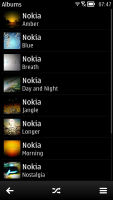


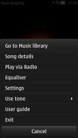
The music player got a slight refresh
While playing, the album art takes the entire top part of the screen (it’s bigger than before), and the track progress bar is bigger, so you can scrub through the song faster. Below is the track info and previous/play/next buttons.
Below them are the repeat and shuffle keys, which used to be hidden in the Options menu. Another handy shortcut is swiping left and right on the album art acts as previous/next track.
NFC is what Belle’s great at
NFC support makes pairing as simple as you could possibly imagine, just put two NFC-enabled gadgets (e.g. a Nokia 701 and headset) together and the two will pair. Hooray, no more PIN codes!
This works great pairing a phone with an NFC-enabled wireless speaker as we’ve already seen. The same goes for pairing your BT headset or headphones.
Sending stuff between NFC-enabled phones works in much the same way – select the files you want to send (one or many) and tap the two phones together. They’ll handle the rest, including switching on the Bluetooth receiver, pairing and transferring – you just need to agree to the transfer.
Check out this promo video for more info:.
NFC is a pretty new technology and while intuitive, you might not find out all its features by yourself – so check out the NFC Tutorial app, which will teach you how to use NFC, offer related news and even list apps and games that support it.
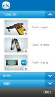
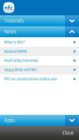

The NFC Tutorial app will teach you everything you need to know about using NFC
Some NFC-enabled games have cropped up – like the special edition of Angry Birds and Asphalt 5 HD.
What needs work
Belle is the best Symbian to date, there’s little question about that, but that doesn’t mean there aren’t things that need to be ironed out.
The new homescreen and main menu, for example, are excellent – but the way rearranging things works needs to change into something consistent. If rearranging shortcuts in the main menu worked like it does on the homescreen, we’d be happy.
Adding folders to the homescreen only through the main menu is a bit confusing too.
The task manager also has room for improvement – fitting only 3 thumbnails on the screen, makes switching between apps harder for heavy multitaskers than it needs to be. Smaller icons that require less scrolling are certainly the way to go here.
Another thing – the CPUs in Nokia phones have gotten fast enough and it’s time to bring full Flash support, not just the Lite stuff. Androids with 600MHz CPUs have attempted to run Flash to some degrees of success. 1GHz CPU and 512MB RAM should provide quite a smooth experience if the software is right.
Over time, Symbian has grown a powerful set of preloaded apps – the problem is they are too many and used to be in subfolders of folders so they were generally hard to find. The Search app, for example, does pretty much what the Android and iOS searches do – search for contacts, messages, apps, files and more.
Those, however, are much easier to access. Better access to such great apps that Symbian offers out of the box would unlock a lot of functionality to users who aren’t particularly tech savvy.
One thing in the suggestion category is that the lock screen could use maybe a widget or a shortcut for starting apps directly. The Sleeping Screen app from Nokia Beta Labs is doing interesting things to the screen, so we’d keep an eye on it.
Conclusion
Symbian Belle brings the Symbian closer to Android and iOS than it’s ever been. Like we said, there’re some less than perfect areas, but overall it would do great in day to day usage. The user experience isn’t Symbian’s biggest problem though.
The one big problem that Belle doesn’t (and can’t) solve is apps. The Ovi Store hasn’t grown anywhere close to its iOS and Android counterparts and it’s the huge app selection that drives people to smartphones.
As users (and consequently devs) are switching away from Symbian to other platforms, the Ovi Store might never catch up, which won’t attract new users. It’s a classic chicken and egg problem, but certainly not one that some smart investments cannot solve.
Third party apps aside, Belle puts Symbian back into the ring as a serious contender by plugging a lot of the many holes in usability of the OS.
But its two big opponents have gained such momentum that most people imagine their next smartphone as an iPhone or a droid. And if they want a Nokia, pretty soon they’d be looking at Windows Phone 7 offerings.
In the end, we wouldn’t mind using Belle on a daily basis, especially when you consider that another big update like this could close the usability gap completely. But we’re worried that by then Symbian would be too far gone to make a comeback.
Featured
Categories
- Mobile phones
- Mobile software
- Mobile computers
- Rumors
- Fun stuff
- Various
- Android
- Desktop software
- Featured
- Misc gadgets
- Gaming
- Digital cameras
- Tablets
- iOS
- Desktop computers
- Windows Phone
- GSMArena
com - Online Services
- Mobile Services
- Smart Watches
- Battery tests
- BlackBerry
- Social Networks
- Web Browsers
- Portable Players
- Network Operators
- CDMA
- Windows
- Headphones
- Hands-on
 Lenovo A7000 Preview
 Oppo R7 battery life test
 Xiaomi Mi 4i battery life test
 Benchmarking Asus ZenFone 2 ZE551ML with Intel Atom Z3580 SoC and 4GB of RAM
 Oppo R1x battery life test
Comments
Rules for posting