Instagram web gets a redesign
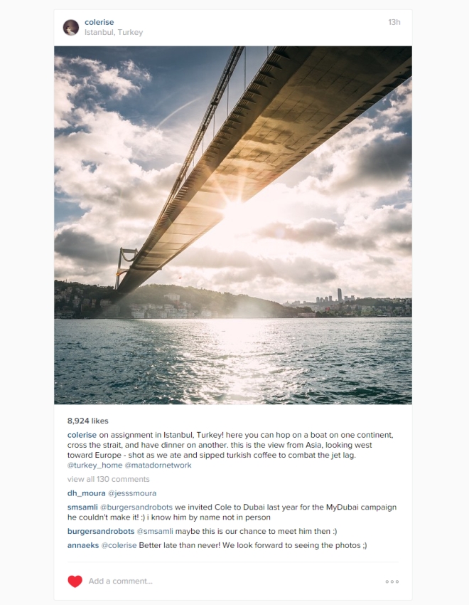
Since the first time the website was introduced several years ago, Instagram has updated the design. The new design is extremely minimal, with a lot of white space and large, full-size images.

The new design gets rid of the grey textured background and the blue top bar, replacing it with a clean white everywhere. The top bar just has the Instagram logo, your account name and a logout button.
The images are now in full size, that is 640 x 640, with more space between them. You can click on an image to see the tagged people or double click to like it as before.

The profile page sees the biggest change, with a clean, spaced out profile description and larger grid of picture thumbnails. You can hover over the thumbnails to see the number of likes and comments on it.
The web design is really impressive. I just wished the company focused on other things, such as increasing the resolution of the images as 640×640 is just not enough these days. And maybe also updating that icon, which looks skeuomorphic and extremely dated now.
Featured
Categories
- Mobile phones
- Mobile software
- Mobile computers
- Rumors
- Fun stuff
- Various
- Android
- Desktop software
- Featured
- Misc gadgets
- Gaming
- Digital cameras
- Tablets
- iOS
- Desktop computers
- Windows Phone
- GSMArena
com - Online Services
- Mobile Services
- Smart Watches
- Battery tests
- BlackBerry
- Social Networks
- Web Browsers
- Portable Players
- Network Operators
- CDMA
- Windows
- Headphones
- Hands-on
 Lenovo A7000 Preview
 Xiaomi Mi 4i battery life test
 HTC One M9+ preview
 Oppo R7 battery life test
 Hot or Not: Android M, iOS 9 and Watch OS 2.0
Comments
Rules for posting