iBooks application gets iOS 7 update
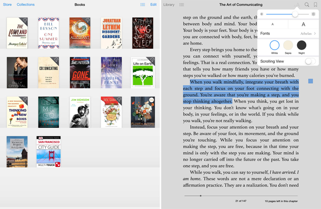
In a spectacular show of laziness, Apple finally got around to updating their own application to match the look of their own operating system. iBooks for iOS 7 finally sports a new look that is more in line with the rest of the OS.

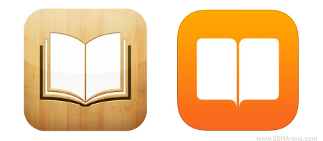
First thing you’ll notice is that the icon has changed. The wood textured icon of the past has now been replaced with an orange one with an open book in the center. Apple continues the tradition of creating utterly lackluster icons post iOS 7 and this new one is just one of the many that actually looks worse than its iOS 6 counterpart.

The UI of the app is now similar to the Newsstand folder. Gone are the classy, wooden shelves of the previous version and are now replaced by sterile rows. You can swipe horizontally to move between your downloaded books, purchased books and downloaded PDFs. The UI within a book is more or less the same with slight changes to the drop down menus and buttons to match iOS 7.
The new iBooks app is now available on the App Store and can be downloaded from the link below.
Featured
Categories
- Mobile phones
- Mobile software
- Mobile computers
- Rumors
- Fun stuff
- Various
- Android
- Desktop software
- Featured
- Misc gadgets
- Gaming
- Digital cameras
- Tablets
- iOS
- Desktop computers
- Windows Phone
- GSMArena
com - Online Services
- Mobile Services
- Smart Watches
- Battery tests
- BlackBerry
- Social Networks
- Web Browsers
- Portable Players
- Network Operators
- CDMA
- Windows
- Headphones
- Hands-on
 Your verdict on Android M, iOS 9 and Watch OS 2.0
 Oppo R7 battery life test
 Hot or Not: Android M, iOS 9 and Watch OS 2.0
 HTC One M9+ preview
 HTC One E9+ performance benchmarks
Comments
Rules for posting