Here’s what’s new in Android 3.0 Honeycomb: screenshots galore
Google is shedding some light on what’s to come with the tablet-oriented Android 3.0 Honeycomb. There are new elements on the screen, designed to improve usability and also better utilize that extra screen real-estate. Google calls this “holographic UI design”.

Here’s a list of changes, complete with screenshots…
Two new bars have been placed on the screen and they will play key roles in the user interface.
The first bar is the System Bar on the bottom of the screen. It’s akin to the current Android notification area but it will also provide soft navigation buttons, including multitasking control.
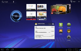
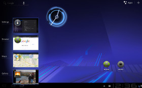
The new homescreen • Switching between apps
Switching between apps will be done using the Recent Apps list accessible from the System Bar. The System Bar is always visible so that its all-important functionality is always accessible, but a “lights out” mode (for full-screen movies and such) will hide it.
The second bar, the Action Bar will be controlled by the individual apps instead of the OS. For example, when you select text, the cut, copy, etc. buttons will be placed on the Action Bar.
Speaking of text, the keyboard keys have been redesigned and repositioned to improve accuracy. Connectivity has also been updated – USB and Bluetooth keyboards can be used on Android 3.0. Sharing the network connection over Bluetooth will be possible too.
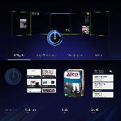
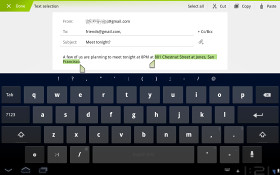
Editing the homescreen • The new kebyoard
The standard apps have been updated too for the new tablet playground. Here are a couple of screenshots along with a list of changes:
- Browser: tabs look very Chrome-like, private browsing mode, unified history and bookmarks view, automatic login to Google services and bookmark sync with Chrome, and interestingly, multi-touch support for JavaScript and plug-ins (Flash, I assume).
- Camera: more controls on the screen for quicker access to most functions
- Contacts: two-pane UI, Fast Scroll, contact info presented in card-like UI
- Email: two-pane UI (hello, iPad), bulk operation shortcuts in Action Bar

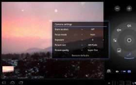
The new web browser and camera app
Here’s a demo video showing off all the UI and app changes:
Android 3.0 also adds support for multi-core processor architectures for faster performance of multi-threaded apps. Older single-threaded apps will also feel a boost thanks to the behind-the-scenes optimizations.
The graphics performance will also improve with a new animation framework, hardware-accelerated 2D graphics and also the new Renderscript 3D engine.
In terms of compatibility, Android 3.0 Honeycomb will run apps developed for the older versions trouble-free. The Action Bar will take over the Menu key responsibilities, housing the extended options of the app and making it feel more in tune with the rest of the UI. Overall, it’s good times ahead for Android devices and users alike.
Featured
Categories
- Mobile phones
- Mobile software
- Mobile computers
- Rumors
- Fun stuff
- Various
- Android
- Desktop software
- Featured
- Misc gadgets
- Gaming
- Digital cameras
- Tablets
- iOS
- Desktop computers
- Windows Phone
- GSMArena
com - Online Services
- Mobile Services
- Smart Watches
- Battery tests
- BlackBerry
- Social Networks
- Web Browsers
- Portable Players
- Network Operators
- CDMA
- Windows
- Headphones
- Hands-on
 Oppo R7 battery life test
 Your verdict on Android M, iOS 9 and Watch OS 2.0
 Lenovo A7000 Preview
 Oppo R1x battery life test
 Samsung Galaxy S6 updated to Android 5.1.1: exploring the differences on video
Comments
Rules for posting