Here’s a video showing off an Intel-based Tizen OS
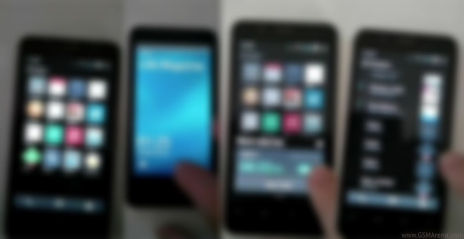
Here’s the first official peek at Intel’s Tizen overlay dubbed Obsidian. It’s probably a very early build as you can see that the animations aren’t all that polished but we get too see what sort of UI dynamics Intel is planning for its own Tizen version.

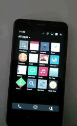
The UI starts off with an All Apps drawer which is reminiscent of Android and features flat icons navigated by means of side-swipes. More after the break.
A swipe to the right reveals the contacts pane. When a certain app has a notification to display the icon is rotated 45 degrees and shows a tiny red-colored highlight at the bottom corner.
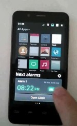
Upon a press on specific apps you’ll get a popup with additional options. The lockscreen seems unchanged from what we’ve seen before and has a slide-to-unlock functionality with not much else.
It’s still Obsidian’s early days and Samsung seems to have gained a little more ground by merging its TouchWiz styling with Tizen.
Featured
Categories
- Mobile phones
- Mobile software
- Mobile computers
- Rumors
- Fun stuff
- Various
- Android
- Desktop software
- Featured
- Misc gadgets
- Gaming
- Digital cameras
- Tablets
- iOS
- Desktop computers
- Windows Phone
- GSMArena
com - Online Services
- Mobile Services
- Smart Watches
- Battery tests
- BlackBerry
- Social Networks
- Web Browsers
- Portable Players
- Network Operators
- CDMA
- Windows
- Headphones
- Hands-on


 Xiaomi Mi 4i battery life test
 Lenovo A7000 Preview
 Benchmarking Asus ZenFone 2 ZE551ML with Intel Atom Z3580 SoC and 4GB of RAM
 HTC One M9+ preview
 Oppo R1x battery life test
Comments
Rules for posting