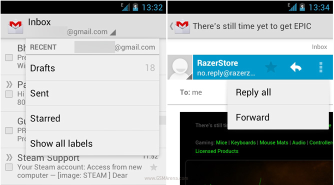
Google urges developers to remove the menu button from Android apps, suggests using the action bar instead
When Google launched the Galaxy Nexus along with Ice Cream Sandwich, they removed the ubiquitous menu button that was found on all the previous Android devices. Instead, they incorporated the functionality of the menu button inside an action bar that appeared on top of the screen. If there were additional options that need not be immediately shown to the user, they were hidden inside a drop down menu signified by a Windows Phone-style vertical ellipsis.

However, this change was only visible inside the native apps in Ice Cream Sandwich whereas the third party apps continued to use a standard menu button functionality, which was replicated on the Galaxy Nexus by displaying the vertical ellipsis in the bar at the bottom of the screen.
It’s obvious that this is not a very elegant solution so now Google is urging everyone to ditch the menu button and incorporate the action bar in their application interface, which as it demonstrated on its site, is not difficult at all. The action bar can show the important functions, like search, up front and if there are any additional options they can be hidden away in the drop down menu. This will help bring some consistency to the UI. Also, having all the options on the screen (even if hidden inside a drop-down menu) means that people are less likely to miss it. Right now, one can miss out on additional options in an app if one forgets to press the menu button. Seeing the option on the screen instantly makes it clear that there are in fact additional options available. Lastly, OEMs will also have to move towards a button-less design for all this to work.
It seems to me that Google is slowly moving towards a button-less future, physical or otherwise. I won’t be surprised if two years later Android totally relied on gestures (like on the N9) or in-app buttons (like in iOS) for navigating through the UI.
Featured
Categories
- Mobile phones
- Mobile software
- Mobile computers
- Rumors
- Fun stuff
- Various
- Android
- Desktop software
- Featured
- Misc gadgets
- Gaming
- Digital cameras
- Tablets
- iOS
- Desktop computers
- Windows Phone
- GSMArena
com - Online Services
- Mobile Services
- Smart Watches
- Battery tests
- BlackBerry
- Social Networks
- Web Browsers
- Portable Players
- Network Operators
- CDMA
- Windows
- Headphones
- Hands-on
 HTC One E9+ performance benchmarks
 Oppo R7 battery life test
 Samsung Galaxy S6 updated to Android 5.1.1: exploring the differences on video
 Oppo R1x battery life test
 Xiaomi Mi 4i battery life test
Comments
Rules for posting