Google updates search engine results page
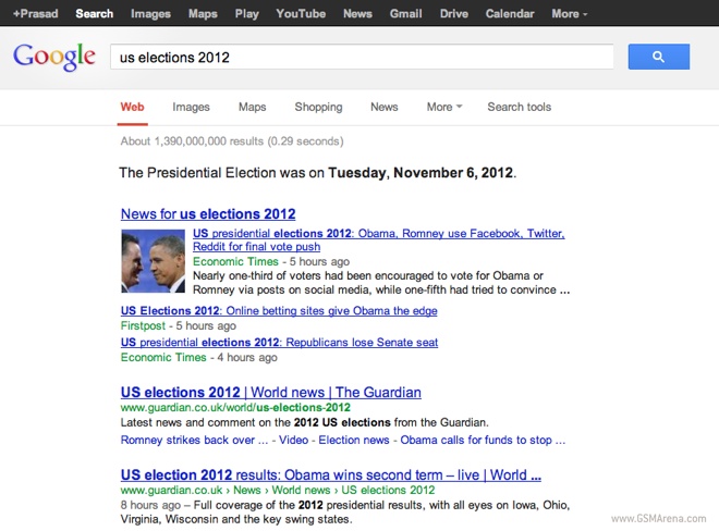
Google has done some minor modifications to their SERP (search engine results page). The new design mostly involves rearranging the navigation controls around.

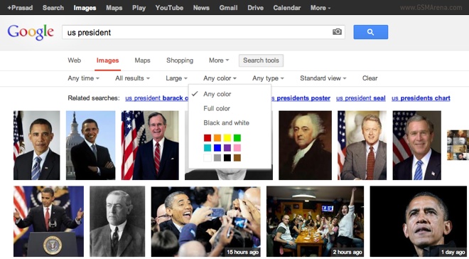
As you can see from the screenshot above, the navigation controls, which previously could be found on the side, have now been moved up top. This works fine for usual web search but poses new problems for image search.

Earlier when you made an image search on Google, you would see options for image size, image type, etc. on the sidebar and you could quickly click them. In the new layout, these additional options are hidden inside a drop down menu called Search tools. Opening it reveals other options, such as Any time, Any size, Any color, etc., so you then have to click on those to access the submenus. So essentially your one click process has now turned into a three click process.
Moving the navigation controls up top has freed up space on the side. The image view fills it with image results, so you now have images spanning the entire width of your browser window. Web searches, however, just show blank white space on the side, which looks remarkably like Bing now.
There seems to be an issue with the ads for now because of which you won’t see them on the side anymore but that’s probably a temporary issue.
Featured
Categories
- Mobile phones
- Mobile software
- Mobile computers
- Rumors
- Fun stuff
- Various
- Android
- Desktop software
- Featured
- Misc gadgets
- Gaming
- Digital cameras
- Tablets
- iOS
- Desktop computers
- Windows Phone
- GSMArena
com - Online Services
- Mobile Services
- Smart Watches
- Battery tests
- BlackBerry
- Social Networks
- Web Browsers
- Portable Players
- Network Operators
- CDMA
- Windows
- Headphones
- Hands-on
 Your verdict on Android M, iOS 9 and Watch OS 2.0
 HTC One E9+ performance benchmarks
 Samsung Galaxy S6 updated to Android 5.1.1: exploring the differences on video
 Benchmarking Asus ZenFone 2 ZE551ML with Intel Atom Z3580 SoC and 4GB of RAM
 Oppo R7 battery life test
Comments
Rules for posting