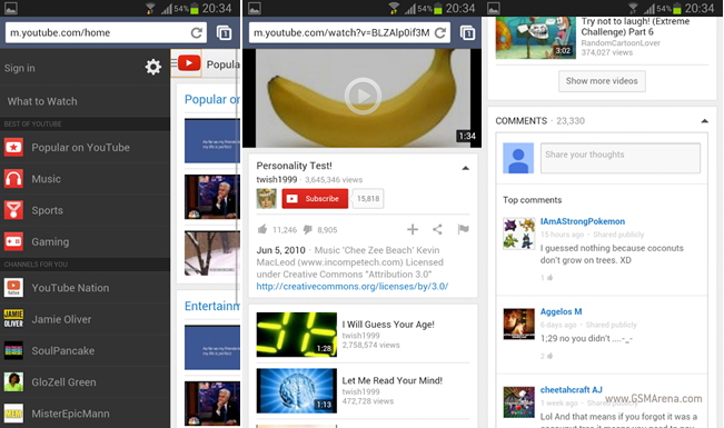
Google toying with cards-style YouTube Mobile browser UI
If there’s one thing that persisted from Palm’s Web OS, it’s the “cards” feature that was so highly touted, and praised, from the now dead operating system.

It seems like Google is testing a cards-centric approach to their mobile YouTube web application. Big G is also playing with the idea of adding in a slide-out side drawer.
This effectively makes YouTube’s mobile web site nearly identical to the YouTube app found on Android phones.
It definitely makes for a marked improvement. The pages look cleaner, making browsing for videos a much more pleasurable process.
Are you excited to use this new YouTube mobile browser? Or are you content with just the application on your phone?
Featured
Categories
- Mobile phones
- Mobile software
- Mobile computers
- Rumors
- Fun stuff
- Various
- Android
- Desktop software
- Featured
- Misc gadgets
- Gaming
- Digital cameras
- Tablets
- iOS
- Desktop computers
- Windows Phone
- GSMArena
com - Online Services
- Mobile Services
- Smart Watches
- Battery tests
- BlackBerry
- Social Networks
- Web Browsers
- Portable Players
- Network Operators
- CDMA
- Windows
- Headphones
- Hands-on
 Benchmarking Asus ZenFone 2 ZE551ML with Intel Atom Z3580 SoC and 4GB of RAM
 Hot or Not: Android M, iOS 9 and Watch OS 2.0
 HTC One M9+ preview
 Xiaomi Mi 4i battery life test
 Samsung Galaxy S6 updated to Android 5.1.1: exploring the differences on video
Comments
Rules for posting