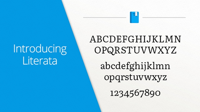
Google has released its new e-book typeface – Literata
A custom typeface, specifically designed for reading, has been a long-running project at Google. The goal was to create a typeface that would provide a smooth and pleasurable reading experience on various devices and resolutions.

As the tech giant puts it:
new book typeface was needed that would provide an outstanding reading experience on a whole range of devices and high resolution screens running different rendering technologies
The culmination of all this effort is Literata. Google has dubbed it “perfect for long reads on all devices” and is even making it a default in Google Books, replacing Droid Serif. The project itself was started back in April 2014 in partnership with TypeFace and was also meant to boost brand recognition for Google Books and give it a unique spin when competing against rivals like Nook and Kindle.
Introducing Google Play Books' new font, Literata. Perfect for long reads on all devices. https://t.co/VQfT6oZvVU pic.twitter.com/eF3B1MJpkX
— Google Play (@GooglePlay) May 18, 2015
Literata takes a lot of its inspiration from Scotch and Roman fonts. It has over 1,100 characters per font and supports PanEuropean language. To add some extra character, Google’s own senior UX designer Addy Lee Beavers, has opted to include some varied texture as well, just to spice things up.
You can take a look at Literata for yourself in Google Books version 3.4.5.
Featured
Categories
- Mobile phones
- Mobile software
- Mobile computers
- Rumors
- Fun stuff
- Various
- Android
- Desktop software
- Featured
- Misc gadgets
- Gaming
- Digital cameras
- Tablets
- iOS
- Desktop computers
- Windows Phone
- GSMArena
com - Online Services
- Mobile Services
- Smart Watches
- Battery tests
- BlackBerry
- Social Networks
- Web Browsers
- Portable Players
- Network Operators
- CDMA
- Windows
- Headphones
- Hands-on
 HTC One M9+ preview
 Your verdict on Android M, iOS 9 and Watch OS 2.0
 Oppo R7 battery life test
 Oppo R1x battery life test
 Lenovo A7000 Preview
Comments
Rules for posting