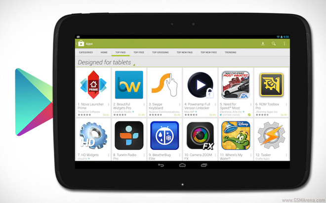
Google Play store update brings Designed for Tablets to default
Android is the undisputed leader in smartphones but has seen criticism when it comes to tablets as many of the apps for those are nothing more than a blown up phone versions.

With its new update to the Play store Google tries to remedy that somewhat by making the Designed for Tablets view the default one – it lists apps that should be tablet-optimized.
Upon a closer inspection some apps that fall into the category of tablet-designed don’t really look the part. For instance Facebook, which has some optimizations for the user interface on iPads (always on top side view of online friends) remains pretty much the same on Android slates as you would find it on droid smartphones – with slide-in menu and friend list on either side and nothing on top of the news feed.
That doesn’t apply to all apps, of course – Viber developers for example have done their homework and implemented a split-screen view. It’s important to note that tablet optimization for apps begins with the developer and not Google.
If for some reason you don’t want to see the Designed for Tablets category you can always change it to Designed for phones.
Featured
Categories
- Mobile phones
- Mobile software
- Mobile computers
- Rumors
- Fun stuff
- Various
- Android
- Desktop software
- Featured
- Misc gadgets
- Gaming
- Digital cameras
- Tablets
- iOS
- Desktop computers
- Windows Phone
- GSMArena
com - Online Services
- Mobile Services
- Smart Watches
- Battery tests
- BlackBerry
- Social Networks
- Web Browsers
- Portable Players
- Network Operators
- CDMA
- Windows
- Headphones
- Hands-on
 Oppo R7 battery life test
 Samsung Galaxy S6 updated to Android 5.1.1: exploring the differences on video
 Lenovo A7000 Preview
 Hot or Not: Android M, iOS 9 and Watch OS 2.0
 Xiaomi Mi 4i battery life test
Comments
Rules for posting