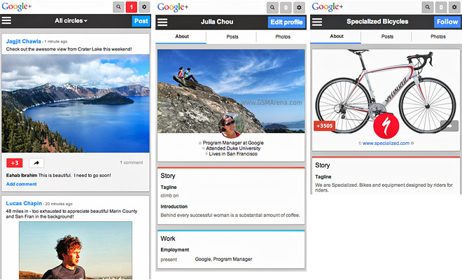
Google+ mobile page gets updated design to match the updated Android app
Google recently updated the desktop version of its Google+ social network and the accompanying Android app. Those who check Google+ through the browser on their smartphone can now enjoy the new design too.

The new Google+ mobile page uses the search giant’s new favorite UI element – the card. Now all posts in your stream are displayed as cards and they feature easy to use +1 and Share buttons.
The Profile and Page, uh, pages have been redesigned too, with a big cover photo and bigger buttons that are easier to hit with your thumbs.
You can check out the new site by opening plus.google.com in your phone’s browser. The site will suggest you download the app if you’re running a supported OS.
Featured
Categories
- Mobile phones
- Mobile software
- Mobile computers
- Rumors
- Fun stuff
- Various
- Android
- Desktop software
- Featured
- Misc gadgets
- Gaming
- Digital cameras
- Tablets
- iOS
- Desktop computers
- Windows Phone
- GSMArena
com - Online Services
- Mobile Services
- Smart Watches
- Battery tests
- BlackBerry
- Social Networks
- Web Browsers
- Portable Players
- Network Operators
- CDMA
- Windows
- Headphones
- Hands-on
 Samsung Galaxy S6 updated to Android 5.1.1: exploring the differences on video
 Hot or Not: Android M, iOS 9 and Watch OS 2.0
 HTC One M9+ preview
 Xiaomi Mi 4i battery life test
 Benchmarking Asus ZenFone 2 ZE551ML with Intel Atom Z3580 SoC and 4GB of RAM
Comments
Rules for posting