Google Mobile app for iPhone is now Google Search app, gets a much cooler UI [VIDEO]
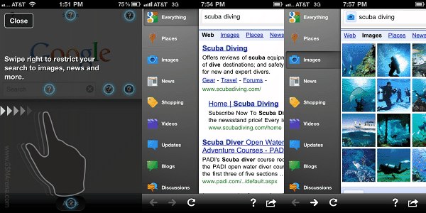
Google has just updated their Mobile App for iOS devices. What was initially meant to be your one-click portal to all of Google services has now been downgraded to a mere Search app. By reducing its focus the Google dev team has managed to make the iOS Search app much nicer to use.

The improvements include a new toolbar that lets you filter your results. To toggle it on you can use one of the newly implemented swipe gestures (left or right) either before you search or once you’ve got your results. You can then select the required filter, like Images, Videos, Shopping etc.
Next you get the setting menu, which is also opened by a swipe gesture, only this time you need to swipe down. It’s also what you should do to see the search bar.
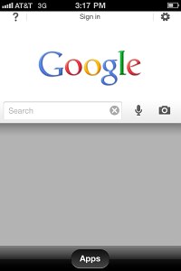
Google also made it easier to pick up searching where you left it off. If you leave the app and come back later, you’ll be able either to start a new search right away (just tap in the search box to type, hit the microphone button to do a voice search or tap on the camera icon to use Google Goggles) or get back to exactly where you were by tapping on the lower part of the page.

Oh and in case you get nostalgic about the Mobile app, there’s an Apps button at the bottom of the screen for rapid access to the mobile versions of the other Google products. It’s not as good as a dedicated app but it’s still something (and Google has some really good web apps).
Here’s the whole thing demonstrated on video.
Mind you, Google also said that they have made updates to many of their other apps. Google Goggles, Voice Search, Search with My Location, Gmail unread counts and more were explicitly mentioned, but the list is said to be even longer than that. Hit the link for more detailed info.
Featured
Categories
- Mobile phones
- Mobile software
- Mobile computers
- Rumors
- Fun stuff
- Various
- Android
- Desktop software
- Featured
- Misc gadgets
- Gaming
- Digital cameras
- Tablets
- iOS
- Desktop computers
- Windows Phone
- GSMArena
com - Online Services
- Mobile Services
- Smart Watches
- Battery tests
- BlackBerry
- Social Networks
- Web Browsers
- Portable Players
- Network Operators
- CDMA
- Windows
- Headphones
- Hands-on
 Lenovo A7000 Preview
 Samsung Galaxy S6 updated to Android 5.1.1: exploring the differences on video
 Hot or Not: Android M, iOS 9 and Watch OS 2.0
 HTC One M9+ preview
 Benchmarking Asus ZenFone 2 ZE551ML with Intel Atom Z3580 SoC and 4GB of RAM
Comments
Rules for posting