Google may overhaul the look of Chrome OS
Although many argue about the functionality of Chrome OS, it’s hard to deny that the tab-based operating system isn’t zippy and easy to use, even if people are clamoring for added functionality.

Well it turns out that Google is thinking about making changes to Chrome, but the alterations be limited to tinkering with the look and feel of Chrome OS only, by taking some design cues from Android for a more universal approach to its software.
The updated look will be part of Google’s Material Design re-branding, which will make its way to the release of Android L.
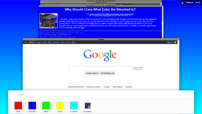
The new Chrome OS look, “Athena”, brings us a cards view, akin to what you would find on Android L’s app switcher. It also looks like Google has added a bottom launcher bar with a search box.
Even though this screenshot is taken from what is an early build of Athena, the new OS look seems to share the same aesthetic cues of Material Design in Android L.
If you hit the source link below then you’ll be able to try out Athena for yourself. Be warned, it’s still in the early stages.
Featured
Categories
- Mobile phones
- Mobile software
- Mobile computers
- Rumors
- Fun stuff
- Various
- Android
- Desktop software
- Featured
- Misc gadgets
- Gaming
- Digital cameras
- Tablets
- iOS
- Desktop computers
- Windows Phone
- GSMArena
com - Online Services
- Mobile Services
- Smart Watches
- Battery tests
- BlackBerry
- Social Networks
- Web Browsers
- Portable Players
- Network Operators
- CDMA
- Windows
- Headphones
- Hands-on
 HTC One E9+ performance benchmarks
 Xiaomi Mi 4i battery life test
 Samsung Galaxy S6 updated to Android 5.1.1: exploring the differences on video
 HTC One M9+ preview
 Lenovo A7000 Preview
Comments
Rules for posting