Google blesses Gmail with a new interface, better navigation and search
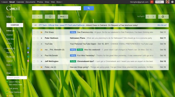
Google has updated the user interface of Gmail, making the popular email service even more attractive. The new UI design adds contacts images to your conversation so you can easily identify the sender of each message and lets you choose the spacing between the elements on the screen.

That makes it easy to customize Gmail for different screen sizes and resolutions. The Gmail devs have also collaborated with iStockphoto and have created new HD themes, if you are into that kind of stuff.
Another change brought by the Gmail update a customizable navigation bar, which lets resize the labels and chat areas if you want to see more, or hide the chat area entirely via the chat icon in the lower left. You can also now use the arrow keys to navigate around the interface.
Finally, Gmail got better searching, featuring a new advanced search panel, which makes it easier and faster to find exactly what you’re looking for. You can use the same panel to create a filter from any search in just a few clicks.
The developers have also prepared a short video walkthrough to give you a better idea of what got changed and how. Check it out.
The rollout of the new UI has already started and, so if you want to switch to it keep an eye for the “Switch to the new look” button in the bottom-right corner of Gmail.
Featured
Categories
- Mobile phones
- Mobile software
- Mobile computers
- Rumors
- Fun stuff
- Various
- Android
- Desktop software
- Featured
- Misc gadgets
- Gaming
- Digital cameras
- Tablets
- iOS
- Desktop computers
- Windows Phone
- GSMArena
com - Online Services
- Mobile Services
- Smart Watches
- Battery tests
- BlackBerry
- Social Networks
- Web Browsers
- Portable Players
- Network Operators
- CDMA
- Windows
- Headphones
- Hands-on
 Lenovo A7000 Preview
 Oppo R7 battery life test
 Benchmarking Asus ZenFone 2 ZE551ML with Intel Atom Z3580 SoC and 4GB of RAM
 Samsung Galaxy S6 updated to Android 5.1.1: exploring the differences on video
 Oppo R1x battery life test
Comments
Rules for posting