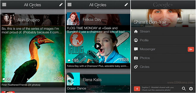
Google+ app for iOS gets updated, looks better than the Android version
The iOS version of Google+ has always trailed behind Android and for obvious reasons. Android belongs to Google so naturally they would want to take better care of their users. But with the latest update to the iOS app, the tables have turned.

Google has taken what was a mundane looking app to something that looks absolutely stunning on the iPhone. Your stream has been completely revamped and instead of a simple looking list of posts you now see the posts listed with big image thumbnails. The images are generated depending on the content of the post. A YouTube link will generate a thumbnail of the video, a photo will show you, well, the photo.
Google has also introduced a new scrolling animation, where new posts just fly in from the bottom of the screen as you continue to scroll. The horizontal scrolling of the previous app is gone and now if you want to change through categories you click on the drop down menu in the top bar.
The navigation has been changed as well. Instead of the boring icons on a white background you now get a list with a dark background and your display picture on top.
The whole app looks significantly better and would make people want to use the service even more and that’s exactly what Google wants right now. The only major complaint we have with the app is that there is still no dedicated iPad version of it.
It’s strange that Google would choose to release such a major update to iOS first, although an Android version would undoubtedly be in the works and should be arriving soon. But as of now, the Google+ does look better on iOS than it does on Android, and you don’t get to say that often.
Click here to download the app for your iPhone and iPod touch.
Featured
Categories
- Mobile phones
- Mobile software
- Mobile computers
- Rumors
- Fun stuff
- Various
- Android
- Desktop software
- Featured
- Misc gadgets
- Gaming
- Digital cameras
- Tablets
- iOS
- Desktop computers
- Windows Phone
- GSMArena
com - Online Services
- Mobile Services
- Smart Watches
- Battery tests
- BlackBerry
- Social Networks
- Web Browsers
- Portable Players
- Network Operators
- CDMA
- Windows
- Headphones
- Hands-on
 HTC One M9+ preview
 Xiaomi Mi 4i battery life test
 Oppo R1x battery life test
 Your verdict on Android M, iOS 9 and Watch OS 2.0
 HTC One E9+ performance benchmarks
Comments
Rules for posting