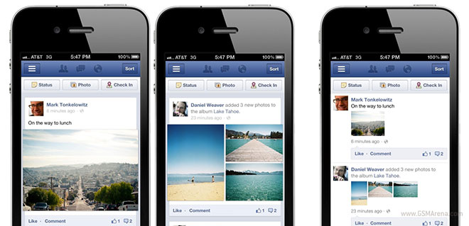
Facebook mobile app and website layout update to show bigger pictures
Within a week of Google releasing an update for its iOS mobile app, Facebook too has released an update for its mobile apps and website that changes the way posts are displayed.

The posts are no longer displayed in a contiguous manner but instead appear in their own separate boxes. But most importantly, images now appear 3x bigger than before and span from edge to edge. Albums are also bigger now and show thumbnails for the contained images arranged in a single large grid. You can see from the first two pictures how it looks and how it looked before in the third picture.
This update is available to m.facebook.com users as well as the iOS and Android apps, and you can get it without having to update the apps.
Featured
Categories
- Mobile phones
- Mobile software
- Mobile computers
- Rumors
- Fun stuff
- Various
- Android
- Desktop software
- Featured
- Misc gadgets
- Gaming
- Digital cameras
- Tablets
- iOS
- Desktop computers
- Windows Phone
- GSMArena
com - Online Services
- Mobile Services
- Smart Watches
- Battery tests
- BlackBerry
- Social Networks
- Web Browsers
- Portable Players
- Network Operators
- CDMA
- Windows
- Headphones
- Hands-on
 Hot or Not: Android M, iOS 9 and Watch OS 2.0
 HTC One E9+ performance benchmarks
 HTC One M9+ preview
 Xiaomi Mi 4i battery life test
 Samsung Galaxy S6 updated to Android 5.1.1: exploring the differences on video
Comments
Rules for posting