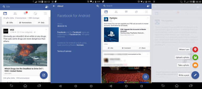
Facebook adds some Material Design elements to its Android app
After quite a few months since Google first unveiled its Material Design guidelines, Facebook has decided to follow them somewhat. The world’s biggest social network is now testing a slightly enhanced look for its Android app, one that has been infused with a few Material Design elements.

As you can see, a big blue floating action button is present. Once you tap that a few options show up, which were previously available to you through a floating blue bar at the bottom of the screen. This bundled the “Take a photo” and “Upload a photo” items together, while “Where I am” used to be known as “Check in”. The old “Status” option from the floating bar is now replaced with “Write a post”.
The About screen tells us that this is version 28 of the app. You probably have 27 now, but even if you are on 28 you may not see the new UI. Facebook routinely tests many small improvements such as these, and sometimes they appear to some users and not to others – because, more often than not, such things are switched on at the server level. Still, if you participate in Facebook’s beta testing program for Android, you may have a few more chances of getting lucky and seeing this new design. However, that doesn’t mean it will ever be rolled out to all Facebook for Android installs out there.
And if Facebook really wants to adhere to Material Design guidelines, it shouldn’t forget to enable the tinting of the Android status bar in Lollipop.
Featured
Categories
- Mobile phones
- Mobile software
- Mobile computers
- Rumors
- Fun stuff
- Various
- Android
- Desktop software
- Featured
- Misc gadgets
- Gaming
- Digital cameras
- Tablets
- iOS
- Desktop computers
- Windows Phone
- GSMArena
com - Online Services
- Mobile Services
- Smart Watches
- Battery tests
- BlackBerry
- Social Networks
- Web Browsers
- Portable Players
- Network Operators
- CDMA
- Windows
- Headphones
- Hands-on
 Benchmarking Asus ZenFone 2 ZE551ML with Intel Atom Z3580 SoC and 4GB of RAM
 Lenovo A7000 Preview
 Xiaomi Mi 4i battery life test
 Samsung Galaxy S6 updated to Android 5.1.1: exploring the differences on video
 Oppo R1x battery life test
Comments
Rules for posting