Evernote web update is simple and beautiful
Evernote has released a new beta version of its web app. The focus of this redesign was on simplicity and the designers seem to have achieved the desired result quite perfectly.

One of the reasons I don’t personally use Evernote web app or Evernote in general is because it comes across as too feature heavy (there is such a thing as too many features) and looks kinda cluttered for simple note taking purposes. The new beta does change that quite significantly.
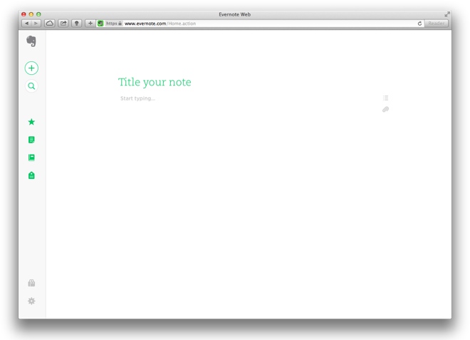
After you choose to switch to the beta version, you are taken to an extremely minimalist page, with the entire focus being on your note. All other options are on the extreme edges of the pages and eventually the items on the left disappear, putting more focus on the note you’re writing.
The new design fools you into thinking it’s a basic app but it is just as functional as it used to be. Just that the clutter has been reduced or hidden away.
If you’ve never used Evernote before or are an existing user, you should give the new beta a try.
Featured
Categories
- Mobile phones
- Mobile software
- Mobile computers
- Rumors
- Fun stuff
- Various
- Android
- Desktop software
- Featured
- Misc gadgets
- Gaming
- Digital cameras
- Tablets
- iOS
- Desktop computers
- Windows Phone
- GSMArena
com - Online Services
- Mobile Services
- Smart Watches
- Battery tests
- BlackBerry
- Social Networks
- Web Browsers
- Portable Players
- Network Operators
- CDMA
- Windows
- Headphones
- Hands-on
 Samsung Galaxy S6 updated to Android 5.1.1: exploring the differences on video
 Lenovo A7000 Preview
 Xiaomi Mi 4i battery life test
 Hot or Not: Android M, iOS 9 and Watch OS 2.0
 Oppo R1x battery life test
Comments
Rules for posting