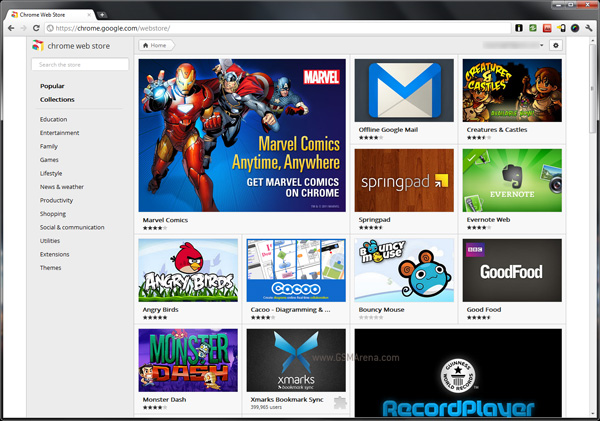
Chrome Web Store gets a facelift, looks even better than before
Just like the Android Market a few months back, Google has updated the Chrome Web Store with a new design that mirrors the square shapes of the new Android Market.

The new look Chrome Web Store looks radically different from its predecessor and I must say is incredibly attractive. And it’s not just a fancy design as well but also very functional. For example, you can mouseover an app and it will quickly shows a description and a download button, which instantly starts the download without opening another page.
The main page scrolls infinitely and you can see a list of categories on the left that remains fixed even as you scroll. You also have a search bar on the top left. As you enter categories, you’ll see breadcrumbs appear on the top bar. On the right you have your settings and an option to view your downloaded apps. This shows all the apps you have downloaded so far and not just the apps that are installed currently on your system, so you can just visit this link when you set up Chrome on a new computer and install all your apps from here without having to remember their names.
The Chrome Web Store can be viewed from other browsers, but interestingly, it shows the old look store whereas only Chrome can view the new style store.
You can visit the Chrome Web Store through the dedicated icon on the new tab page.
Featured
Categories
- Mobile phones
- Mobile software
- Mobile computers
- Rumors
- Fun stuff
- Various
- Android
- Desktop software
- Featured
- Misc gadgets
- Gaming
- Digital cameras
- Tablets
- iOS
- Desktop computers
- Windows Phone
- GSMArena
com - Online Services
- Mobile Services
- Smart Watches
- Battery tests
- BlackBerry
- Social Networks
- Web Browsers
- Portable Players
- Network Operators
- CDMA
- Windows
- Headphones
- Hands-on
 Oppo R7 battery life test
 Hot or Not: Android M, iOS 9 and Watch OS 2.0
 Lenovo A7000 Preview
 Samsung Galaxy S6 updated to Android 5.1.1: exploring the differences on video
 Oppo R1x battery life test
Comments
Rules for posting