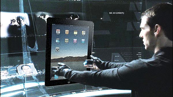
Apple iPad UI adds new multi-touch gestures, new UI elements
When the iPhone first appeared, it revolutionized touch interfaces. The new Apple iPad has a lot more real estate for touch gestures and it includes a few new ones that make good use of the larger screen and there are additions to the UI itself as well…

Gizmodo have put together a sort of “best of” video of the new elements and interactions. For example, swiping with two fingers triggers a different reaction than swiping one. The iPad can even track three fingers “turning” an airlock. Tap and hold to drag is also a commonly used gesture.
The biggest addition to the iPad UI is the popover element. Popovers are a bit like a crossbreed between multi-level menus and popups. The popover occupies only a portion of the screen and presents a list of options – each option can lead to a another level of the menu with even more options.
Because only a small part of the screen is covered, popovers leave most of the information on the screen visible and only a small part changes as you navigate the menu – much better than the whole screen sliding back and forth to get you to the option you need. A tap ouside the popover naturally discards it.
Here’s the video so you can see those elements in action for yourself:
The two finger slide to throw a granade actually seems to be compensating for the lack of hardware buttons quite well, which is good news for gaming on the iPad. You can also see the second major addition to the UI – the Media Navigator shown in the iWork section, which is apparently Apple iPad’s replacement for a file browser.
It seems that with the iPad you will finaly be able to feel like Tom Cruise in Minority Report and do two handed multi-touch gestures. The only problem I see with the two-hand gestures is that on a table the iPad might wobble too much because of its curved back, so that would leave only your legs as proper support for two-handed gestures.
Featured
Categories
- Mobile phones
- Mobile software
- Mobile computers
- Rumors
- Fun stuff
- Various
- Android
- Desktop software
- Featured
- Misc gadgets
- Gaming
- Digital cameras
- Tablets
- iOS
- Desktop computers
- Windows Phone
- GSMArena
com - Online Services
- Mobile Services
- Smart Watches
- Battery tests
- BlackBerry
- Social Networks
- Web Browsers
- Portable Players
- Network Operators
- CDMA
- Windows
- Headphones
- Hands-on
 HTC One E9+ performance benchmarks
 Xiaomi Mi 4i battery life test
 Lenovo A7000 Preview
 Oppo R1x battery life test
 Benchmarking Asus ZenFone 2 ZE551ML with Intel Atom Z3580 SoC and 4GB of RAM
Comments
Rules for posting