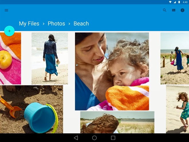
Android L’s Material design promo video arrives
The latest Android version, only known as the L release for now, brings a wealth of cool new features, but Google is particularly proud of the UI enhancements it offers. The company calls the new look Material design and believes it’s cooler and more fluid than anything it has ever produced before.

We even got a short video, highlighting the new design that you can check out here. The 48 second clip shows various parts of the UI that have been updated in Android L release, including the Google Now cards, the calendar and even the calculator.
Your thoughts on the new Android look are welcome in the comments section below.
Featured
Categories
- Mobile phones
- Mobile software
- Mobile computers
- Rumors
- Fun stuff
- Various
- Android
- Desktop software
- Featured
- Misc gadgets
- Gaming
- Digital cameras
- Tablets
- iOS
- Desktop computers
- Windows Phone
- GSMArena
com - Online Services
- Mobile Services
- Smart Watches
- Battery tests
- BlackBerry
- Social Networks
- Web Browsers
- Portable Players
- Network Operators
- CDMA
- Windows
- Headphones
- Hands-on
 Benchmarking Asus ZenFone 2 ZE551ML with Intel Atom Z3580 SoC and 4GB of RAM
 Xiaomi Mi 4i battery life test
 Lenovo A7000 Preview
 Oppo R1x battery life test
 Oppo R7 battery life test
Comments
Rules for posting