Android cloud-based music app leaks – looks cool, we have the screens to prove it
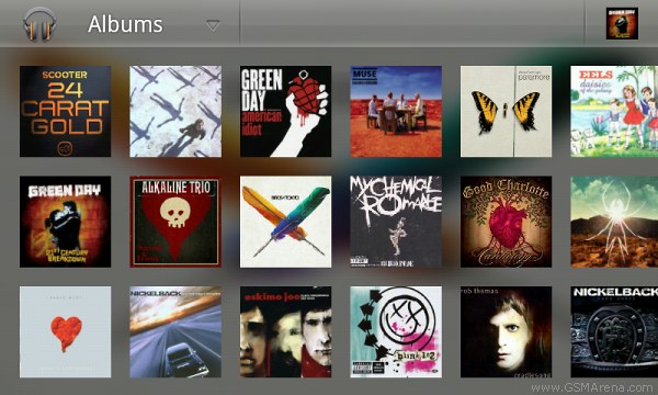
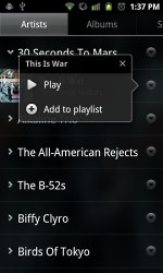
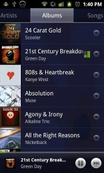
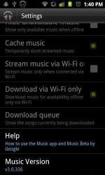
By a lucky coincidence a tech site – Techfrom10 dot-com, came across the new Music application for Android. We’ve prepared some screenshots to show you how good the new UI looks.

In terms of looks the new music app looks a lot like the Vanilla gallery. It has interactive backgrounds, which move around, float and change colors. Usability needs some polishing, though. It lagged on our Optimus 2X and didn’t seem too intuitive. For example the music player on the Samsung Galaxy S is way easier to use – and looks great too.
In the new music app you can stream your track collection wirelessly and you get the option to cache it on your device – to listen to it in airplane mode, for example. You also have to download through Wi-Fi only, to save on data charges.
The sorting is done by the usual suspects. You have Artists, Albums, Songs, etc. Album Art is managed in the same gallery style. It looks beautiful, especially in portrait mode.
Featured
Categories
- Mobile phones
- Mobile software
- Mobile computers
- Rumors
- Fun stuff
- Various
- Android
- Desktop software
- Featured
- Misc gadgets
- Gaming
- Digital cameras
- Tablets
- iOS
- Desktop computers
- Windows Phone
- GSMArena
com - Online Services
- Mobile Services
- Smart Watches
- Battery tests
- BlackBerry
- Social Networks
- Web Browsers
- Portable Players
- Network Operators
- CDMA
- Windows
- Headphones
- Hands-on


 Xiaomi Mi 4i battery life test
 Hot or Not: Android M, iOS 9 and Watch OS 2.0
 Samsung Galaxy S6 updated to Android 5.1.1: exploring the differences on video
 HTC One E9+ performance benchmarks
 Your verdict on Android M, iOS 9 and Watch OS 2.0
Comments
Rules for posting