Amazon overhauls its Silk browser
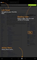
Amazon pre-installs the Silk browser on its Kindle tablets but hasn’t really improved on it in a while. Now it brings an update to the browser, which revamps the UI, brings new features and gives some old ones a fresh new look and feel.

Among the novelties are redesigned tabs, an upper left-placed menu panel and a new start page featuring your most visited pages. The address bar brings up the keyboard by default, there’s improved easier access to the Reading View (which compiles the article without ads or banners) and more.
Once you launch the updated Silk browser you’re immediately greeted by an on-screen tutorial, dubbed Just-In-Time, which walks you trough the new features.
Users have complained that tabs in Silk were too flat and confusing – you wouldn’t know which tab you were currently on – so Amazon redesigned them with rounded edges and different colors for the active and non-active tabs.
Upon a scroll down the page you’ll also now get fullscreen view, with the browser controls hiding automatically.
Featured
Categories
- Mobile phones
- Mobile software
- Mobile computers
- Rumors
- Fun stuff
- Various
- Android
- Desktop software
- Featured
- Misc gadgets
- Gaming
- Digital cameras
- Tablets
- iOS
- Desktop computers
- Windows Phone
- GSMArena
com - Online Services
- Mobile Services
- Smart Watches
- Battery tests
- BlackBerry
- Social Networks
- Web Browsers
- Portable Players
- Network Operators
- CDMA
- Windows
- Headphones
- Hands-on


 Hot or Not: Android M, iOS 9 and Watch OS 2.0
 Benchmarking Asus ZenFone 2 ZE551ML with Intel Atom Z3580 SoC and 4GB of RAM
 HTC One E9+ performance benchmarks
 Your verdict on Android M, iOS 9 and Watch OS 2.0
 HTC One M9+ preview
Comments
Rules for posting