Meizu m1 note hands-on
We were very impressed with the Meizu MX4 and even more impressed with its bigger counterpart the Meizu MX4 Pro but to cover all interested users, the China-based maker has a cheaper phablet in the face of the Meizu m1 note.

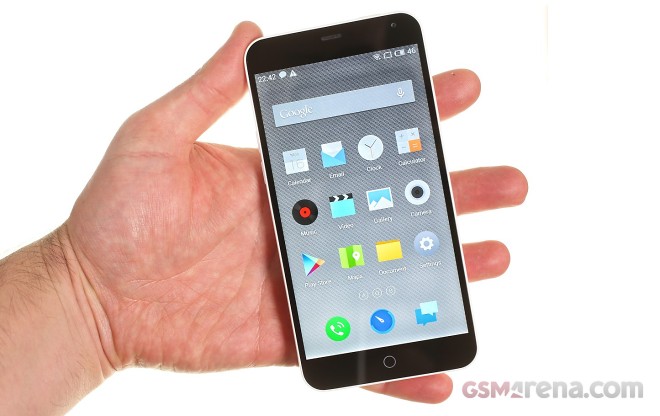
It cuts a few of the more premium hardware characteristics but the looks and feel are every bit as good. The screen is a 5.5″ IPS unit of a lower 1080p resolution (compared to the 1536p of the MX4 Pro) but is every bit as bright and colorful.
There is no metal around the device but the sloping edges and curved corners feel familiar and comfortable just as before – it really takes some time before you realize this is a 5.5″ device – shame on you Apple iPhone 6 Plus.
Another key area of omission is the motherboard – the Meizu m1 note relies on a Mediatek MT6752 chipset with octa-core Cortex-A53 processor and “only” 2GB of RAM. The 13MP camera doesn’t offer UHD recording either. But the available hardware prowess is still quite enough to provide a stellar experience – see for yourselves below.
The Meizu m1 note back cover is made of glossy white plastic that extends all the way to the front glass. We would have preferred a matte surface but we can’t argue the m1 note feels comfortable in the palm. The phone’s body is rounded and sloping and doesn’t have a sharp note to any of its design.
It also feels light and compact for its display size. The only time it ever looks big is when compared to an LG G3, which offers an outstanding screen to body ratio. Speaking of the screen – the 1080p panel on the front offers the characteristic vivid colors, some really wide side viewing angles, great contrast and great sharpness. It’s a great display even compared to the excellent Apple iPhone 6 Plus panel – which is great. Ok, moving on.
We’re yet to evaluate the synthetic, camera and battery performance so we’ll keep the observations down to the most basic and physical. The display sits completely flat and the plastic shell that wraps around it end at a sharp meeting point with the front glass. This means that fingers don’t slide out when the screen ends – we would like to see a 2.5D curved glass on a Meizu smartphone soon.
The software is also very distant from Google’s vanilla implementation and is made to look more like Apple’s iOS. While that is fine and good we would also like to see Flyme OS on top of the latest Android build – Lollipop – if only for the enhancements under the hood.
Overall our first impression of the Meizu m1 note is good – we’re impressed! The move to a more affordable but seemingly almost as good phone by Meizu looks brilliant. The m1 note truly feels almost as good as the MX4 Pro which is great for a smartphone that’s that cheap. Meizu should be able to monetize the lower midrange and not give into competition from devices such as the HTC’s Desire 820 or the Samsung’s Galaxy A7.
Ok, with all that out of the way, it’s time to give the Meizu m1 note the full review treatment. Stay tuned!
Featured
Categories
- Mobile phones
- Mobile software
- Mobile computers
- Rumors
- Fun stuff
- Various
- Android
- Desktop software
- Featured
- Misc gadgets
- Gaming
- Digital cameras
- Tablets
- iOS
- Desktop computers
- Windows Phone
- GSMArena
com - Online Services
- Mobile Services
- Smart Watches
- Battery tests
- BlackBerry
- Social Networks
- Web Browsers
- Portable Players
- Network Operators
- CDMA
- Windows
- Headphones
- Hands-on


 Xiaomi Mi 4i battery life test
 Oppo R7 battery life test
 Lenovo A7000 Preview
 HTC One E9+ performance benchmarks
 Samsung Galaxy S6 updated to Android 5.1.1: exploring the differences on video
Comments
Rules for posting