Flickr 3.0 for iOS and Android bring a completely new design
Flickr has released version 3.0 of the iOS and Android app that is a complete overhaul over the previous versions. To put it simply, it now looks like Instagram.

The update is available on both iOS and Android and for once we see no preference given to either platform, with both getting the latest update with a UI optimized for that particular platform (unlike Instagram).
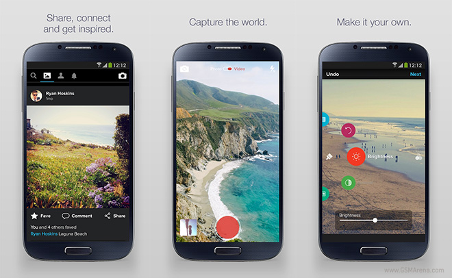
You will see a blacked out timeline on both with square crops of images of the people you are friends with. Below the image are options to fave, comment or share the image. If you tap it, you will see the full size version.
On iOS, you can see buttons to switch between your timeline and your profile along with a camera button and on Android you can swipe horizontally to switch between these modes. The app has its own custom camera with the interface once again different on both platforms. The app also has impressive editing options for once you take the photo, which are once again differently designed (but equally powerful) on both platforms.
Another new feature is auto-sync for your photos, which automatically backs up any photo you take on to your account. This is similar to what Dropbox or Google+ does but in this case you get a stonking 1TB of storage from Flickr.
Overall, this is an excellent update and might just get people interested in Flickr again.
Featured
Categories
- Mobile phones
- Mobile software
- Mobile computers
- Rumors
- Fun stuff
- Various
- Android
- Desktop software
- Featured
- Misc gadgets
- Gaming
- Digital cameras
- Tablets
- iOS
- Desktop computers
- Windows Phone
- GSMArena
com - Online Services
- Mobile Services
- Smart Watches
- Battery tests
- BlackBerry
- Social Networks
- Web Browsers
- Portable Players
- Network Operators
- CDMA
- Windows
- Headphones
- Hands-on
 Hot or Not: Android M, iOS 9 and Watch OS 2.0
 Benchmarking Asus ZenFone 2 ZE551ML with Intel Atom Z3580 SoC and 4GB of RAM
 HTC One M9+ preview
 Your verdict on Android M, iOS 9 and Watch OS 2.0
 Oppo R7 battery life test
Comments
Rules for posting