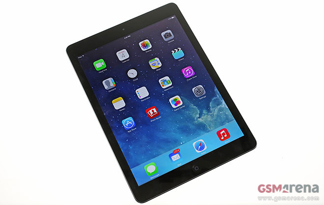
Sleek bezels, thin edges and a diet that did wonders – here’s the iPad Air hands-on
While many were awaiting the iPad mini with Retina display, Apple was busy running the larger iPad through the treadmill so that when the unveiling came, it won’t fall into the shadow of its smaller sibling.

So much so, in fact, that once unveiled, it was revealed that the rudimentary upgrade was not to the big iPad but, in fact, the iPad mini. The streamlined body, reduced weight and retention of the great display made the iPad Air the talk of the town, garnering the front spot on Apple’s website is a testament to that.
Here goes a brief rundown of the iPad Air’s retail package, design and software for your viewing pleasure.
Let’s start off with the hardware. The iPad Air is nothing like its cumbersome predecessors. Compared to the fourth generation iPad, the latest one warrants its Air moniker by being 1.9 mm thinner, 1.2 mm shorter and a colossal 16.2 mm narrower. Weight has been reduced by a mind-boggling 183 grams – that’s the equivalent of a Nokia Lumia 920, to put things in perspective.
The back is now flat and the sloping edges are thinner and come to a beveled stop at the front where back meets an equally flat front. For the first time we see stereo speakers on the bigger iPad. We’re very pleased with their loudness, although they sound just a little hollow and the whole tablet vibrates when you’re listening to something.
Once you pick up the iPad Air you’ll immediately appreciate its low weight, even if you haven’t seen or held an iPad before in your life. If you’re a regular 9.7″ iPad user the difference will feel striking. To accommodate the difference Apple has gone with thinner side bezels and lighter materials, including a much smaller battery.
iOS 7 handles the software side of an otherwise great hardware package. The OS feels like an overblown port from the smaller iPhone – the grid of apps remains the same only you get more apps in the dock and a landscape mode. However digging a little deeper reveals a split-screen mode for most built-in apps like Settings, Contacts, Notes, etc.
Multi-finger gestures are available for launching the task switcher or swapping apps, but otherwise this is the iOS 7 you know and are familiar with if you’ve ever used an iPhone.
Stay tuned for our in-depth review.
Featured
Categories
- Mobile phones
- Mobile software
- Mobile computers
- Rumors
- Fun stuff
- Various
- Android
- Desktop software
- Featured
- Misc gadgets
- Gaming
- Digital cameras
- Tablets
- iOS
- Desktop computers
- Windows Phone
- GSMArena
com - Online Services
- Mobile Services
- Smart Watches
- Battery tests
- BlackBerry
- Social Networks
- Web Browsers
- Portable Players
- Network Operators
- CDMA
- Windows
- Headphones
- Hands-on
 Samsung Galaxy S6 updated to Android 5.1.1: exploring the differences on video
 Lenovo A7000 Preview
 HTC One M9+ preview
 Oppo R7 battery life test
 Benchmarking Asus ZenFone 2 ZE551ML with Intel Atom Z3580 SoC and 4GB of RAM
Comments
Rules for posting