Twitter updates mobile apps and website, brings Holo UI to Android version
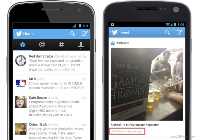
Twitter has updated the Android and iOS version of its mobile application, along with the mobile version of their website. The biggest changes are in the Android version, which gets a brand new UI that follows the new Holo UI guidelines (for most parts).

The new Twitter for Android now lets you swipe horizontally on the screen to move between the tabs on the top. This means that you can no longer swipe on an individual tweet to get quick access to tweet options. Moving between hierarchies is now accompanies by slick sliding animations where the next screen is stacked above the previous one, similar to the animation in the stock Android app drawer.
Other major change is the use of the Roboto Light font, although this wasn’t really the brightest decision from the designers. Although a good font in general, the Light version is far too thin to render properly on low-resolution or PenTile displays, especially at smaller sizes and ends up looking jagged and terribly unreadable. If you have a high resolution (720p and above) RGB LCD then it should look okay but a switch to Roboto Regular would be much appreciated.
Another change is that the menu button no longer shows additional options, which have now been moved to the fourth tab. However, if you have an HTC device, it would still show the menu button on the screen as the functionality hasn’t been disabled in the app.
The new app also supports the new cards that were added in Twitter, where you can see expanded previews for content such as image galleries, apps and product listings.
The iOS app, on the other hand, got fewer changes, including:
• Faster launch times and general performance upgrades
• “Retweeted by” in Tweet detail is now tappable
• Fix for reply-to-self in conversations
• Fix for bug that prevented undoing retweets in some cases
The iOS app and mobile site also show previews for new content like the Android app.
You can download the Android and iOS apps from the links below, or visit the mobile site from here.
Featured
Categories
- Mobile phones
- Mobile software
- Mobile computers
- Rumors
- Fun stuff
- Various
- Android
- Desktop software
- Featured
- Misc gadgets
- Gaming
- Digital cameras
- Tablets
- iOS
- Desktop computers
- Windows Phone
- GSMArena
com - Online Services
- Mobile Services
- Smart Watches
- Battery tests
- BlackBerry
- Social Networks
- Web Browsers
- Portable Players
- Network Operators
- CDMA
- Windows
- Headphones
- Hands-on
 HTC One E9+ performance benchmarks
 Your verdict on Android M, iOS 9 and Watch OS 2.0
 Samsung Galaxy S6 updated to Android 5.1.1: exploring the differences on video
 Hot or Not: Android M, iOS 9 and Watch OS 2.0
 Lenovo A7000 Preview
Comments
Rules for posting