Microsoft replaces Hotmail with Outlook.com, gets a million new users in a few hours
Microsoft has launched the new Outlook.com, which replaces the existing Hotmail webmail service. The new website makes good use of the Metro UI and also offers users to switch from their current @hotmail.com email addresses to @outlook.com addresses.

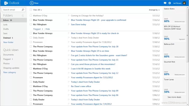
Upon opening the new website you’ll notice just how clean and uncluttered the UI is. In fact, it’s so minimalistic that at first glance you’d think you accidentally opened the mobile version of the website.
On the left you have your usual folder list including items such as Inbox, Junk, Drafts, etc. You can right-click on these to access additional options, such as marking all mails as read or creating a new folder.

On the top you have the Outlook logo with a drop-down menu that lets you switch to your contacts, calendar or SkyDrive account. Weirdly, though, only the Contacts page uses the new Metro UI, whereas the Calendar and SkyDrive app use the same old Hotmail style UI. Worse still, once you switch over to these services, there is no toggle option on the top so you can’t quickly switch back to Outlook. It feels like you have opened a whole new service from a different provider altogether, which is jarring.
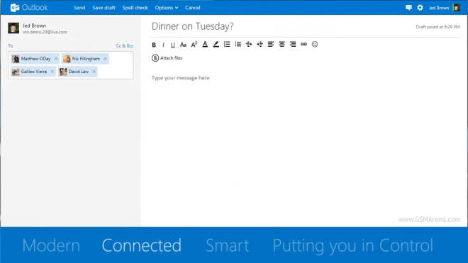
Coming back to the Mail app, you will find the option to create a new mail on top. Clicking it opens a two pane window, with the ‘To’ on the left and the mail editor on the right.

Going back to the top bar, you will find a button to launch the messenger on the right, next to a settings button and your profile button. The messenger service not only lets you send messages to people using Windows Live, but much like the messaging app in Windows 8, it also lets you to chat with people on Facebook. Microsoft is also going to integrate Skype in future so you can communicate with your Skype friends as well. Sweet!

The Contacts section shows you your Hotmail contacts but you can also add contacts from other services such as Facebook, Twitter, LinkedIn and Google. The contacts appear in a pane on the left and their information on the right once you click on them. Marking multiple contacts makes them appear as tiles on the right. You will have to do this in order to manage your contacts as you can’t right-click on them individually for some reason.

There is also a new mobile version of the site that you can access from your iOS or Android smartphones. For some reason, the same site loads on the iPad as well, even though the full desktop version would work great om most tablets.
Another interesting feature is that you can now pick up to five different email aliases to use with your standard email. Once you set up any extra aliases, you will be able to use them to send and receive email right from your regular email inbox.
Overall, the Outlook.com is a solid update to the well-known Hotmail service. It looks fresh and approachable and something you’d want to use on a daily basis. It would be tough for Microsoft to pull people away from Gmail, which has served everyone well over the years. Still, initial numbers suggest that Microsoft seems to be doing pretty well, with over a million new users signing up in just a few hours of the service going live. Yet, it remains to be seen how many of these are just going to try it out for a while and never go back and how many will stick around. For old Hotmail users, though, who have stuck around with the service for all these years, there are now fewer reasons to switch over to something like Gmail.
Featured
Categories
- Mobile phones
- Mobile software
- Mobile computers
- Rumors
- Fun stuff
- Various
- Android
- Desktop software
- Featured
- Misc gadgets
- Gaming
- Digital cameras
- Tablets
- iOS
- Desktop computers
- Windows Phone
- GSMArena
com - Online Services
- Mobile Services
- Smart Watches
- Battery tests
- BlackBerry
- Social Networks
- Web Browsers
- Portable Players
- Network Operators
- CDMA
- Windows
- Headphones
- Hands-on
 Xiaomi Mi 4i battery life test
 Benchmarking Asus ZenFone 2 ZE551ML with Intel Atom Z3580 SoC and 4GB of RAM
 Oppo R7 battery life test
 HTC One M9+ preview
 Your verdict on Android M, iOS 9 and Watch OS 2.0
Comments
Rules for posting