Twitter goes through a major redesign, updates the web UI, TweetDeck and mobile applications in one go
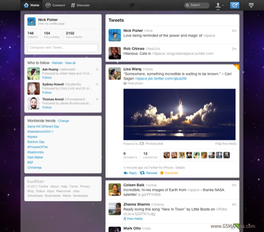
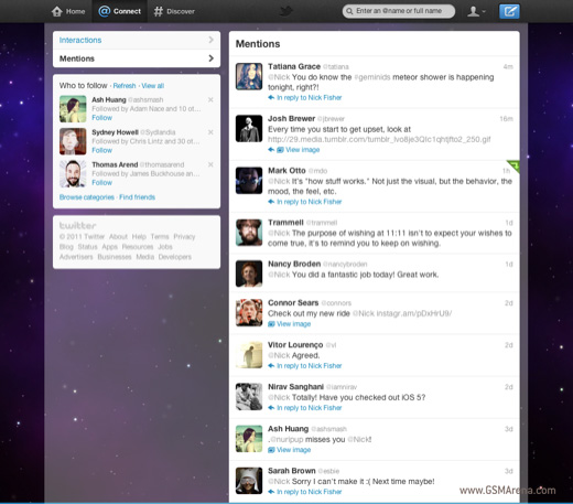
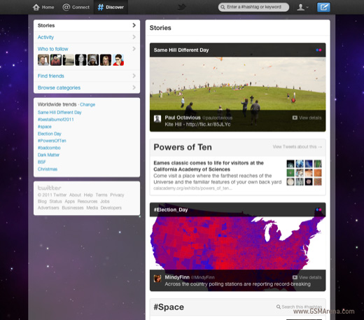
Twitter released a major update yesterday that spanned their website, mobile applications and even the recently acquired TweetDeck. The web interface now includes a new top bar with three new tabs for Home, Connect and Discover.

Home is your timeline where you can see tweets from the people you follow and yourself. The profile information and additional options that were present on the right side of the previous design have been shifted to the left. You can now click on tweets to expand them and if there are any images or videos embedded then they can be viewed right then and there. If it’s a reply to other tweet(s) then you can see the entire conversation there as well. The new design also puts more emphasis on the real names of the users (or whatever they entered as their real name in their profile) instead of the usernames.

The Connect tab has two categories, Interactions and Mentions. Interactions shows you your mentions as well as information about who followed, retweeted or fav’d you. Mentions simply shows you your @Replies.

The Discover tab is where Twitter gets its money from. You can see sponsored updates from companies such as ESPN, Google, etc.These are not just ads, though, but more like what’s going on around you. So you will see something about a sporting event or a news article or a new product launch, etc. from various sources. You can switch to the Activity view, where you can see what people you follow have been up to. And then you have the Who to follow, Find friends and Browse categories sections there as well.

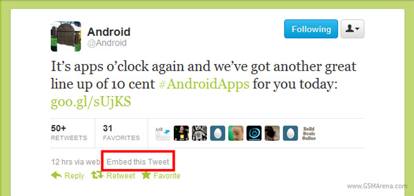
There are also two new interesting features in the web UI. It now lets you easily embed any tweet anywhere. You have to click on the Details button for the tweet and you get an option to Embed this Tweet, after which it presents you the embed code that you can paste on your website. The second feature is the enhanced profile page for marketers. If you use your Twitter account for business purposes you get a nice big image to have on top of your profile page, along with the ability to select which of your tweets are visible to your visitors and select a top tweet from them.
Moving on to the mobile apps, for now the changes are limited to only the Android and iOS version, that too specifically the iPhone/iPod touch version. The iPad, BlackBerry and Windows Phone versions are still stuck on their older UI. These new apps mimic the UI of the web interface and have the same tab structure, which makes it easy to jump between the two. Unfortunately, both the apps sacrifice certain features that were found in their older versions in this new interface design.
Then there is TweetDeck, which was acquire by Twitter a few months back. The situation with TweetDeck is a bit confusing. It has a new icon that looks like the official Twitter apps and a new UI but it doesn’t look similar to the web UI. Also, the mobile versions of TweetDeck still look the same as before. There is a new desktop app that uses HTML5 instead of Adobe Air but works only on Windows and Mac. The Chrome app has also been updated and looks identical to the desktop app. Both now make having a TweetDeck account mandatory.
To find out more you can check out the video and the source links below.
Featured
Categories
- Mobile phones
- Mobile software
- Mobile computers
- Rumors
- Fun stuff
- Various
- Android
- Desktop software
- Featured
- Misc gadgets
- Gaming
- Digital cameras
- Tablets
- iOS
- Desktop computers
- Windows Phone
- GSMArena
com - Online Services
- Mobile Services
- Smart Watches
- Battery tests
- BlackBerry
- Social Networks
- Web Browsers
- Portable Players
- Network Operators
- CDMA
- Windows
- Headphones
- Hands-on
 Hot or Not: Android M, iOS 9 and Watch OS 2.0
 HTC One E9+ performance benchmarks
 Benchmarking Asus ZenFone 2 ZE551ML with Intel Atom Z3580 SoC and 4GB of RAM
 Xiaomi Mi 4i battery life test
 Oppo R7 battery life test
Comments
Rules for posting