Flipboard for iPhone review – shrinking the magazine style the right way
Flipboard is a digital magazine-like application that combines all of your Facebook, Twitter, website news, articles, photos and more into one live feed for simple (and gorgeous) browsing from one dedicated place. It used to be an iPad exclusive up until the other day when Flipboard launched a version for the iPhone too and we thought we’d take it for a spin and do a little impromptu review of it.

Once the app launched yesterday things went seriously wrong and Flipboard’s servers were overwhelmed by the incredible demand. Today Flipboard updated the app and things started working again. We’ve prepared screen shots for you guys and also a video demo of Flipboard for iPhone, join us after the break for the full scoop.
The iPhone Flipboard app looks very similar to the iPad one but it is operated vertically instead of horizontally like a book would. So people coming from the iPad version may need some time to adjust to the shift in operating direction. For newcomers, the app navigation feels natural and fluid. Here’s a video demo of Flipboard that we shot on the iPhone.
The content you’ve set up in your Flipboard is presented in a gorgeous way – focus is on the headlines and images of an article or tweet so you could just peek inside a website, for instance, at a glance and decide if you want to get deeper into a story without having to open the full page up and then coming to the conclusion that it doesn’t interest you.
Flipboard can sync with your Twitter, Facebook, Google Reader, LinkedIn, Thumblr and more. You can also set webpages to appear in your feed, which basically means that the entire world wide web is available at your fingertips right from the Flipboard app itself. It offers a very easy way of aggregating your entire daily browsing into a well organized and easily customizable place.
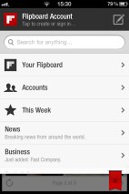

Setting up your accounts is simple
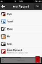
You can also hand pick from a number of categories that suit your interests. You can also reorder the categories you’ve set up, which is very convenient – deleting them is an option too.
Browsing a category displays all the results from it. Here are two examples from the photography category, swiping up and down gives you images from a number of sources, such as National Geographic and more.


Viewing a category in Flipboard
The Flipboard interface features a constant virtual search button at the top right, which can be used for finding just about anything on the internet. You can search for websites, browse different categories and more. Upon entering a searchword, GSMArena for example, Flipboard lists the Twitter feed of the website, the website itself, its RSS feed and many more.
Opening up a random website will get you all of its posted articles. Clicking on an image or a headline opens up the article in a built-in Safari window and you can interact with the webpage the same way you would with Safari itself.


GSMArena.com through Flipboard
Once on a page you also get a series of options and interactions too – you can re-tweet, comment, “favorite” it on Twitter, share the page or choose to open it up in the full featured Safari browser.
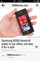


Zooming on an article gives you options
Finally, you can reorder the services you’ve selected right on Flipboard’s main screen. It’s done very easily and will come as second nature to most iPhone users – just tap-and-hold a finger on a content window and you’ll get the familiar delete/move scenario you get on your Springboard. The only thing you cannot move or remove is the Flipboard cover tile, which is the first one in the app.
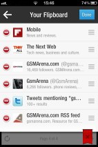


Reordering your pages in Flipboard
Flipboard is a great app for browsing online content and saves you the need to go and check your Facebook, Twitter, Google Reader or even your best website separately. It offers a unique interface and one you’ll quickly get the hang of and probably love in no time. We’re also impressed with the way Flipboard outed its iPhone application, server overwhelming issues aside. They could’ve just reused the iPad version and ported it to the iPhone but they didn’t. Flipboard has put in the effort to optimize the iPhone app and it certainly has paid off.
We can only think of one direct competitor to Flipboard and that would be Pulse – or is it the other way around? Pulse came along with both an iPad and iPhone apps right from the get-go and was very innovative at the time. But Flipboard has gone that extra mile to bring users something really new and exciting, groundbreaking even.
The app is free and you can get it right now. All you need is an iPhone 3GS, 4 or 4s, an iPod Touch 3rd or 4th generation or either of the iPads. We’ve added a download of it below in the source link.
Featured
Categories
- Mobile phones
- Mobile software
- Mobile computers
- Rumors
- Fun stuff
- Various
- Android
- Desktop software
- Featured
- Misc gadgets
- Gaming
- Digital cameras
- Tablets
- iOS
- Desktop computers
- Windows Phone
- GSMArena
com - Online Services
- Mobile Services
- Smart Watches
- Battery tests
- BlackBerry
- Social Networks
- Web Browsers
- Portable Players
- Network Operators
- CDMA
- Windows
- Headphones
- Hands-on






 HTC One E9+ performance benchmarks
 Hot or Not: Android M, iOS 9 and Watch OS 2.0
 Oppo R1x battery life test
 HTC One M9+ preview
 Samsung Galaxy S6 updated to Android 5.1.1: exploring the differences on video
Comments
Rules for posting