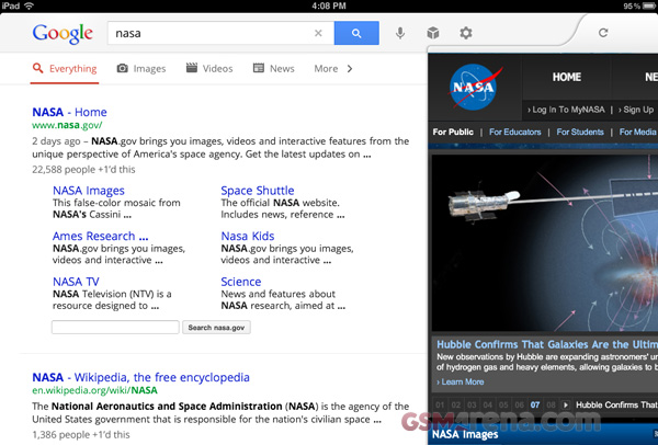
Google redesigns the Google Search app for iPad, makes it not suck for once
Google’s apps for iOS so far have ranged from mediocre to downright lame. A lot of them were just the mobile versions of their mobile site with a slight redesign to fool the users into thinking they are using a proper app and not just a mobile site. But their latest Google Search app changes all that.

The redesign makes the app look completely different and unlike most of their other iOS apps, completely awesome. The best part about it is that it finally feels like a proper app and not just another tab in Safari.
Now when you search for something, Google Instant kicks in and shows you suggestions as you type. When you click on a result a window slides in from the right on top of the search results. You can browse the page or you can swipe it right so that you can see the search results below and start another search. There is also an Instant Preview function, that shows you snapshots of the web pages in the search result so you can visually determine which page you want to open instead of just relying on the page name and description.

The image search has also changed. You can click on an image and it brings a carousal-like screen with the selected screen on the front and lets you move back and forth between images by swiping on the screen.
There is also a new history view. It can be brought up by swiping the page right. This shows you stacks of web page snapshots that you opened for a particular search term and clicking on a stack shows all the webpages inside. Finally, there is also voice search, for times when you don’t feel like typing.
As before the Google Search app is now available on iTunes completely free of charge. This is one of those must-have apps that deserves a place on your dock.
Featured
Categories
- Mobile phones
- Mobile software
- Mobile computers
- Rumors
- Fun stuff
- Various
- Android
- Desktop software
- Featured
- Misc gadgets
- Gaming
- Digital cameras
- Tablets
- iOS
- Desktop computers
- Windows Phone
- GSMArena
com - Online Services
- Mobile Services
- Smart Watches
- Battery tests
- BlackBerry
- Social Networks
- Web Browsers
- Portable Players
- Network Operators
- CDMA
- Windows
- Headphones
- Hands-on
 Lenovo A7000 Preview
 Oppo R7 battery life test
 HTC One M9+ preview
 Benchmarking Asus ZenFone 2 ZE551ML with Intel Atom Z3580 SoC and 4GB of RAM
 HTC One E9+ performance benchmarks
Comments
Rules for posting