This is how the Windows 8 might look like, you are not going to like it
The SP1 for Windows 7 hit the PCs around the world only recently, but Microsoft is already prepping the next Windows installment – version 8. Some developers aleady have access to an alpha version (Milestone 3) and we get to see a a glimpse of it right now.

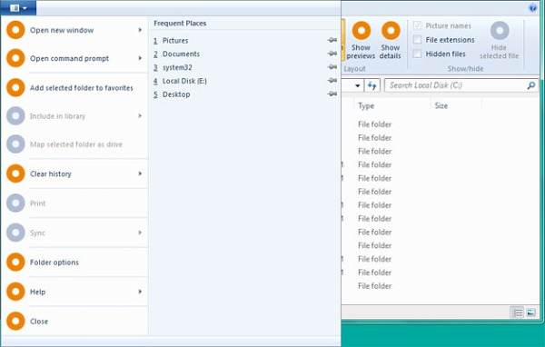
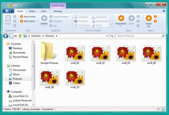
The most important visual change you’ll notice is the tabbed (ribbon) structured menu on various places. It’s similar to the Microsoft Office 2010 looks and honestly, it’s quite ugly.

I understand the ribbon interface was introduced into the Office suite to simplify its interface and eliminate the drop-down menus, but transferring it to Windows? It seems Microsoft is trying to spare us the right-click menu here and the end result is rather confusing, even a bit ugly. There is a lot of time ahead before the RTM version gets ready and I believe Microsoft will get it right in the end.

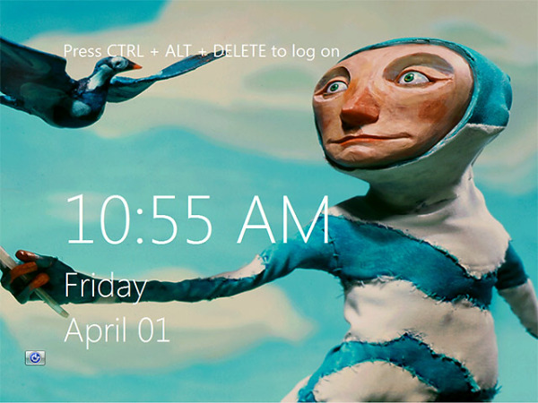
The next visual change is the log-on screen, which resembles the Windows Phone 7 Metro UI. There is also a profile picture in the system tray, right next to the clock.

Despite the date, the screenshot is confirmed to be authentic
Windows 8 is also rumored to have an 8-minute installation process and an option for factory reset – just like in the phones. That way you can always rollback to a fresh start should something go wrong.
According to some leaked roadmaps we should see the official Windows 8 beta this summer (June/July), while the Release Candidate will come in the autumn (September/October). The final version of Windows 8 is expected in early 2012.
Featured
Categories
- Mobile phones
- Mobile software
- Mobile computers
- Rumors
- Fun stuff
- Various
- Android
- Desktop software
- Featured
- Misc gadgets
- Gaming
- Digital cameras
- Tablets
- iOS
- Desktop computers
- Windows Phone
- GSMArena
com - Online Services
- Mobile Services
- Smart Watches
- Battery tests
- BlackBerry
- Social Networks
- Web Browsers
- Portable Players
- Network Operators
- CDMA
- Windows
- Headphones
- Hands-on
 Lenovo A7000 Preview
 Hot or Not: Android M, iOS 9 and Watch OS 2.0
 Oppo R7 battery life test
 Your verdict on Android M, iOS 9 and Watch OS 2.0
 HTC One M9+ preview
Comments
Rules for posting