New Android Market app starts rolling out, here’s a quick review
Google announced the updated version of the Android Market app a while back but there was one small problem, the update wasn’t available for download then. But now we are hearing Google has finally started rolling out the update to device with Android 2.2 and higher. And we couldn’t help ourselves and we went to see what it’s all about.
The version number for this latest update is 3.0.27 (the one that leaked before was 3.0.26). Apparently, if you were running the previously leaked version you will automatically be updated to the new version.
Personally, I didn’t receive the update automatically (and I have a Nexus S, for crying out loud) so I got impatient and sideloaded it. I have been using it for some time now and here are my quick impressions of it.
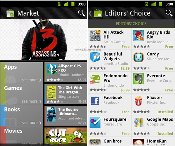
First of all, it definitely looks a lot better. Wasn’t a big fan of the previous version which looked like someone puked all over my screen after eating some radioactive waste. The new one uses green more subtly with a lot more black thrown in. Also, curved lines have been dumped in favor of straight lines. And there’s not so much space wasted.


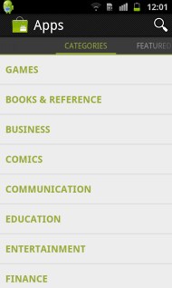
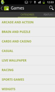
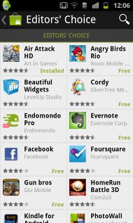
The app categories are not in a hierarchical order any more but placed next to each other and you need to swipe horizontally on the screen to move between them. There are also a lot more categories, such as top grossing, top new paid, top new free, trending apps and staff picks. The app will also contain Google Music Beta and Google Books if you reside in the US.
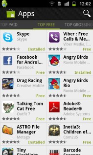
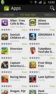
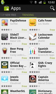
The new square grid layout is definitely better. You see a lot more apps on screen at once and hence it is a lot more functional at the same time being better looking. Click on an app and you can see the screenshots prominently on the top above the description. You can scroll through the screenshots horizontally the way you can in the App Store app in iOS. Click on them to view them full screen. The full screen view is loaded along with the thumbnails so it displays the images immediately after you click on them. All the other things that were there before such as reviews, developer info and related apps are still there below in the same order.
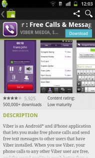

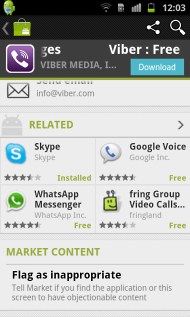
The Download button remains on top with the app name even if you scroll down on the page. If the app is already installed you will get an Open button along with an uninstall button. You can also share the app now using any of the installed applications.
There is now also an option in the Market app to switch your Google account.
The Market icon has been slightly updated. Bit of green added to the inside of the shopping bag but you’ll hardly notice that.

The new UI gives you no reason to use the hardware back button on your Android phone. This is probably keeping in mind the next version of Android, Ice Cream Sandwich, which is likely to make hardware navigation buttons on phones obsolete. Even the new Android Music application does this.
Contrary to some online comments, I didn’t quite find any similarities between the new UI and Windows Phone 7. Just because it uses square shapes, doesn’t mean it looks similar. Matchboxes are square. Doesn’t mean Microsoft copied their design.
That’s it for now. If you notice anything else, do let us know in the comments below.
Featured
 Lenovo A7000 Preview
 Your verdict on Android M, iOS 9 and Watch OS 2.0
 Oppo R1x battery life test
 Xiaomi Mi 4i battery life test
 HTC One E9+ performance benchmarks
Categories
- Mobile phones
- Mobile software
- Mobile computers
- Rumors
- Fun stuff
- Various
- Android
- Desktop software
- Featured
- Misc gadgets
- Gaming
- Digital cameras
- Tablets
- iOS
- Desktop computers
- Windows Phone
- GSMArena
com - Online Services
- Mobile Services
- Smart Watches
- Battery tests
- BlackBerry
- Social Networks
- Web Browsers
- Portable Players
- Network Operators
- CDMA
- Windows
- Headphones
- Hands-on
Comments
Rules for posting