HTC One series Menu button mystery solved
Ever since HTC announced the One series at MWC last month, the one thing that has been bugging me was the layout of the keys at the bottom of the display. You see, unlike the Galaxy Nexus, HTC went for hard keys that are permanently placed at the bottom of the display, instead of soft keys on the display.
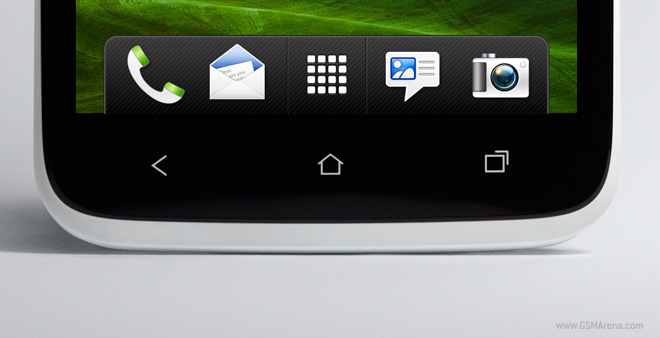
As you can see, there is no dedicated Menu button, because Android 4.0 does not require a dedicated Menu button. Google has advised developers to get rid of the Menu buttons completely and place all the important functions on the screen itself, with the other, less important functions inside a drop down menu placed on the top right of the screen in ICS-optimized apps. But what about the older apps that are not ICS-optimized and rely on the Menu button to display all the additional functions?

On the Galaxy Nexus, this problem was solved by displaying a temporary Menu button on the screen, as seen above. The button would appear on the right of the three keys already present on the screen and did not take any extra space. But the HTC One series phones have the keys placed on the outside, so what you see below is the solution HTC had to come up with.
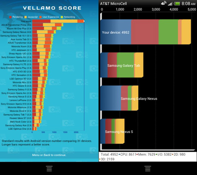
These are the benchmark scores for the AT&T version of the HTC One X. As you can see, non-ICS-optimized app (such as Vellamo and Quadrant seen in the screenshot above) will force the OS to display a separate Menu button, found all alone in a separate bar at the bottom, which, quite frankly, looks silly.
Now I understand why HTC may not have chosen to place the keys on the display itself because then they always end up using a portion of the display, whether the app needs to display a Menu button or not, thus reducing the accessible screen real estate to the app and the user. By placing the keys separately below the display, all the pixels on the screen are available to the app. But the problem is, this would have worked marvelously had all the apps been optimized for ICS, which is not the case. So for a long time, users of the One series handsets will have to deal with this extra button at the bottom of their screens. Hopefully, this will make the developers optimize their apps for ICS even quicker, so they don’t stick out like this on newer devices.
Featured
 HTC One E9+ performance benchmarks
 Oppo R1x battery life test
 HTC One M9+ preview
 Samsung Galaxy S6 updated to Android 5.1.1: exploring the differences on video
 Xiaomi Mi 4i battery life test
Categories
- Mobile phones
- Mobile software
- Mobile computers
- Rumors
- Fun stuff
- Various
- Android
- Desktop software
- Featured
- Misc gadgets
- Gaming
- Digital cameras
- Tablets
- iOS
- Desktop computers
- Windows Phone
- GSMArena
com - Online Services
- Mobile Services
- Smart Watches
- Battery tests
- BlackBerry
- Social Networks
- Web Browsers
- Portable Players
- Network Operators
- CDMA
- Windows
- Headphones
- Hands-on
Comments
Rules for posting