Google Currents 2.0 brings new UI, loads of other changes
Google has updated the Google Currents application to v2.0, which brings with it some really nice changes. First of all, the UI has been changed and looks nothing like the previous version. It now has more in common with some of the other recent Google Android apps, such as YouTube and Google+.
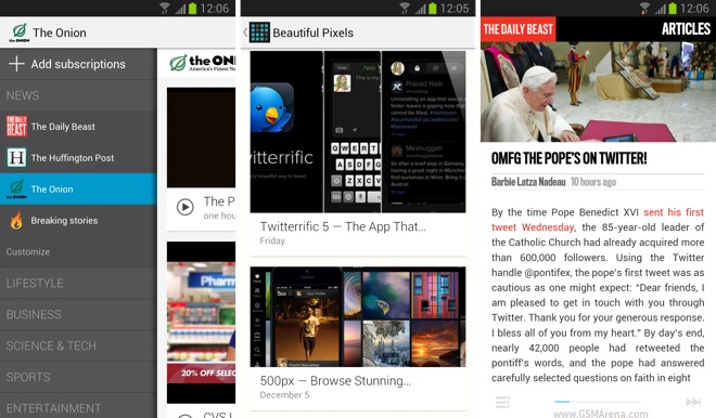
The application features a new editions list that can be accessed from swiping from the left side of the screen. You see all your categories and the selected sources within. You can customize this list by adding or removing the sources.
Select a source and you’ll see that the articles appear as large thumbnails that span the width of the display, just like in the YouTube or the Google+ app. While scrolling you’ll get that lovely flowing tiles animation you see on the Google+ app. Click on one and you’ll see a similar side-scrolling UI as in the previous version of the app. Go all the way to the right and then you can advance to the next post. You can also star an article for viewing it later.
Once you view an article, the thumbnail grays out, which is a nice touch. You can choose to have it removed from the list entirely as well. I couldn’t find a way to mark an article as unread, however, in case I accidentally opened it.
Other than that there are some other changes as well. Here’s the complete changelog:
* Edition sidebar – quickly access your editions within categories such as business, sports, etc.
* Fast scan – Vertical swipe to scan an edition, horizontal swipe advances to next edition
* Edition-section chooser – Choose “Customize” to filter out sections
* Unread marks – Read stories are marked. (Setting to hide)
* Breaking stories – ranked by Google News. Links to full length content.
* Saved stories – star for future reference
* New catalog design
* Widget
To download the new Google Currents app for Android, click here.
Featured
 Oppo R1x battery life test
 Lenovo A7000 Preview
 Xiaomi Mi 4i battery life test
 HTC One M9+ preview
 Hot or Not: Android M, iOS 9 and Watch OS 2.0
Categories
- Mobile phones
- Mobile software
- Mobile computers
- Rumors
- Fun stuff
- Various
- Android
- Desktop software
- Featured
- Misc gadgets
- Gaming
- Digital cameras
- Tablets
- iOS
- Desktop computers
- Windows Phone
- GSMArena
com - Online Services
- Mobile Services
- Smart Watches
- Battery tests
- BlackBerry
- Social Networks
- Web Browsers
- Portable Players
- Network Operators
- CDMA
- Windows
- Headphones
- Hands-on
Comments
Rules for posting