Clear for iOS is out, we go hands-on
Do you remember Clear for the iPhone? The innovative app for creating to-do lists and managing tasks was made available on the Apple AppStore yesterday and our hands were itching to give it a spin.
The idea behind Clear is simple – easy to-do lists creation. And it does it effortlessly, while relying on an effective, intuitive one-of-a-kind user interface. And that’s a rare thing even in today’s app-filled mobile world.
Developed by Realmac Software, Clear says “No!” to trivial mobile app looks and embraces a sleek, minimalist design controlled mainly by common gestures like swipe and pinch.
Clear is built upon three main levels of operation. On the top level view you have the apps options and a shortcut to your lists. As options go, Clear isn’t going to win any prizes with its three different settings. No syncing, no exporting.
The second level or layer contains all your different task lists like “Personal”, “Shopping”, “Work”, etc. To create a new one, just tap on a blank part of the screen and it automatically creates a new list and prompts you to give it a name.
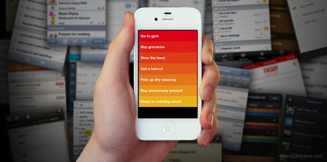
Now we are in the most interesting aspect of the app – managing tasks. Adding task happens in one of two ways – with a pinch out or by swiping to the bottom. Then the app urges you to give the task a name and that’s about the only thing you can do with it. No calendar, no fine details, no nothing – just straight-to-the-point text limited to 28 characters.
By giving you only the basic, the Clear app wants you to focus on the tasks instead on the apps itself. For some it will be the best thing since sliced bread, for others – not so much. Depends on what you’ll be using it for.
Once you’ve created a couple of tasks, they get colored in red, orange or dark yellow depending on their priority. The more recent goes to the top automatically but you can freely rearrange them. You can change the task’s location within the list its in with a tap-and-hold.
With a swipe on a task to the right it gets marked as checked and colored with a green background and strike-through text. This whole animation is accompanied by a subtle sound, which makes the experience even more delightful. To delete an item, just swipe it to the left.
To refresh the tasks in a list, just do a swipe up. And if you want to go up to the list view, just pinch out and the tasks screen will fold to reveal the list view. Neat.
Now, sit back, relax and watch out video overview of the Clear app in action.
All this is fine and dandy if you get used to the gestures and if you can live with the absolute basic functionality any task manager app can offer. It is as if the great user interface comes at the price of more robust settings and extras like syncing with popular online services.
I hope that the app developers would consider porting this fine piece of software to Android so that even more people can enjoy its great user interface. Speaking of wishes, it’d be great if Clear’s team implements some kind of syncing and/or exporting. Plus, one or two more bells and whistles would make my heart warmer, too.
So, what do you think of Clear for iOS?
Featured
 Samsung Galaxy S6 updated to Android 5.1.1: exploring the differences on video
 HTC One E9+ performance benchmarks
 Benchmarking Asus ZenFone 2 ZE551ML with Intel Atom Z3580 SoC and 4GB of RAM
 Xiaomi Mi 4i battery life test
 Oppo R1x battery life test
Categories
- Mobile phones
- Mobile software
- Mobile computers
- Rumors
- Fun stuff
- Various
- Android
- Desktop software
- Featured
- Misc gadgets
- Gaming
- Digital cameras
- Tablets
- iOS
- Desktop computers
- Windows Phone
- GSMArena
com - Online Services
- Mobile Services
- Smart Watches
- Battery tests
- BlackBerry
- Social Networks
- Web Browsers
- Portable Players
- Network Operators
- CDMA
- Windows
- Headphones
- Hands-on
Comments
Rules for posting